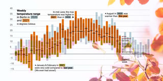
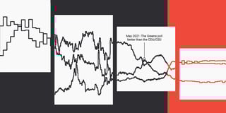
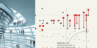
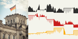
Weekly Charts All blog topics >
Every week, one of us builds a Datawrapper chart, map, or table. Get inspired by data vis storytelling — and please copy our ideas!
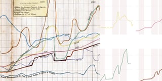
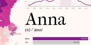
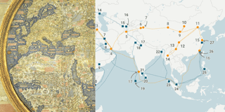
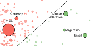
Two to tango: 200 years of Argentina’s diplomatic relations
How to get to space
One day in complaint
Who decided British place names should be this confusing?
Mind the gap, scale the map (markers)
Is this miserable London weather for real?!
Mapping a Super Bowl halftime show
Radish to romanesco: A year in vegetables
Brewing a new map of Europe
Pay to play
Reading around the world
Meet the tracking companies that follow you around the internet
Social (and other) networks in Datawrapper
Election madness 2024 — one year in the Data Vis Dispatch
🍎 and 🍏, but no raspberry emoji 🤔
Which chart types did our users create in 2024?
Point after point
Flight delays? Snow problem.
Argentina’s escape from Kafka’s castle
We’re waiting longer than ever for our favorite TV shows to return
New York’s slow (noisy, polluted) road to congestion pricing
The gender income gap, squared
How a flower became the main character of the late Pleistocene
What are Americans afraid of?
A retrospective of 15 years of data visualization projects
Into the Death Zone
The world could be your oyster, but it depends on your passport
Why bi visibility matters
My first Weekly Chart… about what?!
Poles (and others) at the polls in Pennsylvania
Raising relief maps from a line chart
Google searching for election outcomes
Germany’s richest people are indeed very, very rich
How bicycle friendly is Germany?
A bad chart got better – and then bad again
Is all fitness tracker data just an n=1 experiment?
The battle for streams (and what it’s doing to music)
Dinosaurs: Long dead but still on the move
Practical tactical voting
The history of left-handedness
Every meteorite we saw falling down to earth
The problem with long term investments
Could you add a map of Kirkjubæjarklaustur?
Visualizing music
After 20 years of streaming, how is the music industry doing?
Does drinking coffee make your country richer?
How do we use the Earth’s land?
The first platform wars
Where to get Bojangles biscuits
Music festivals in Europe
Humanity deserves more humane drug policies
A total eclipse in photos
Where would Germany be without Fukushima?
French people are losing confidence in the Paris Olympics
Household work: More equal, but far from equal
Collaboration on the Datawrapper app team
Shh! Animals are sleeping
The Great Drowning of Men
Remaking a 200-year-old chart
Downs and ups in the crossword
The shapes of a working day
Harder, better, faster, stronger… forever?
Visualizing vernacular variety in various vinyls
Connecting the dots of population growth in Germany
Vibes in Verse: Decoding the band TEMMIS
Predictions for 2023, revisited
Which chart types did our users create in 2023?
Just over half of U.S. residents can leave the U.S.
Looking back at my year in running data
Is there a movie franchise crisis?
Who might win the next UK Election?
Mapping second first languages
Germany’s highest bandwidth is a pigeon’s wingspan
The Unofficial NYC Subway Rat Census
A recipe for Datawrapper
Why do Swiss people die?
Love in the fast lane
The Nobel Prize-winning theory on why the gender gap is still a thing
Hot Strike Summer: A Prequel
How we configured autoscaling for Datawrapper image exports
Birdwatching by the billion
Speaking, singing, and clicking in whale
Who’s behind the wheel in the U.K.?
Thirty days of biking in Berlin
The “new normal”: Charts on how we at Datawrapper slowly return to the office
Using DuckDB to analyze over 95 million taxi  rides
Fleeting encounters in Mrs. Dalloway’s London
This is the 300th Weekly Chart
Visualizing my musical journey
Special Olympic Games in Berlin
Why German trees are (and aren’t) dying
A fair way (or four) to look at global carbon emissions
The most common baby names are far less common these days
Te(a) or cha(i)?
British marriage, zoomed out
How long are Brits waiting to start a family?
The Magdeburg skyline in an area chart
How Vienna found a unique model for low rent
The 2018 Central Park Squirrel Census
Spring in Berlin
What is it with backend developers and %@$*! phones?
How many composers have I listened to?
Once in Perugia, always in Perugia
Do we use our right to vote?
The bestselling Mario games of all time
From Eimsbüttel to Neuland: The city of Hamburg and its 100+ districts
The minefield in Earth’s orbit
How to measure the Earth
Faster dashboards with web components
Families in the housing crisis
A primer on Foreign Direct Investment
Brazil’s unique views on race
A tale of love, woe, and data vis
For the poor, retirement is short(er)
Recreating a chart from history: a beginner’s look in the data vis world
Resolve as I say, not as I do
New Year’s around the world
The biggest movies of 2022
Which chart types did our users create in 2022?
No more white Christmas?
Trains versus planes
The case for speed limits
Women and hidden violence
Visualizing my year in music with a calendar heatmap
What is driving our carbon emissions and what to do about it
A gap on the map: How busy are the rails?
When do people watch fireworks around the world?
How committed are my projects?
How transparent are my clothes?
Could your vote swing the Senate?
MariLINE Monroe: More line chart art
Which ticket should I buy?
In the climate crisis, vulnerable countries bear the least responsibility
With a balloon toward the North Pole
Is the FIFA World Cup good or bad for the host nation’s economy?
Why web pages can have a size problem
How long do animals sleep?
Is the Rhine drying up?
Animating a globe with a scatterplot
Is it a bug or a feature?
The masked bandits come to Germany
The long way around
Are there good words to divide the world?
Globalization, Supply Chains, and Conflict in the Crimea
What background color should your data vis have?
Where houseplants really come from
One year in vis
A look at some depressing data about school shootings in the U.S.
May 2022 set a new record for the inflation rate in Germany. Here is an overview of the last 70 years.
Cloudy climate… with a chance of meatballs
Going back in time on abortion law
Sex and the census
The race to build the fastest supercomputer
Convenience stores on every corner
Who made my clothes?
We are pushing the planet over the edge
A table set for fasting
Wheat at war
Macron’s “Falklands effect”
When will spring arrive?
Flight routes and map projections
War and power
It’s raining wherever I go
What can we learn from medieval prices and wages?
Green color shows where words match
The true cost of driving
Lego builds itself (back) up
More money, more COVID-19 vaccinations? Let’s look at the outliers with a bivariate map.
Three decades of European government leaders
How Datawrapper developers perceive the cost of function names
Which chart types did our users create in 2021?
A wave of words
Santa’s Helpers
Anna – the most common name in Sweden
The meanings of life
From Osaka to Johannesburg by bike
Queer stories of violence in Berlin
An early Berlin Christmas
An endless summer day in December
A heatmap for the cool fall days
Plotting fall temperatures with our new range & value overlays in column charts
The give and take of volcanoes
Your favorite chart type is more flexible than you think
Years, months, days, and hours — in one chart
The climate crisis inside our heads
When will Europe phase out coal?
How the Social Democrats came to lead the German polls, up-close
Which German party is the most unlucky when it comes to election dates?
Is this normality yet?
Days with extreme heat are likely becoming more frequent
By 2037, human-made materials will outweigh all living things on Earth
Can you raise an Olympic snowboarder in the tropics?
Who did people spend time with in 2020?
A happy life: Does it depend on where you live?
How Barcelona is claiming its streets back from cars
How much hotter will it get in your lifetime?
Three simple ideas for better election poll graphics
A full month more above 20°C
Game of Life
Summer is here! It’s the best time to eat fresh local fruits — and create tables
Who would want to leave New York?
Counting the sunny hours
How do men and women spend their time?
Why nobody knows how to pronounce my name in Japanese
Does a higher budget make a movie more successful?
Three things people spent money on in 2020
The dancing cranes of Lake Hornborga
How historic vaccination research paved the way for the COVID-19 vaccine
Commuting & Covid-19: How the pandemic changed my travel behavior
The Container Crunch
The older you get, the higher your life expectancy
Who owns the Nile?
A real heatmap
Making waterlines in locator maps move: an experiment
Just another hottest day ever in February
Is science still a man’s world?
A tilemap of Switzerland cantons – with some twists
The oldest U.S. Senate to date, but not the least representative
Why are there so many Wikipedia articles in Swedish and Cebuano?
A minimal chart about global warming for the hottest year on record
How much money did I lose by not investing in Bitcoin?
Who got vaccinated first against SARS-CoV-2?
Which chart types did our users create in 2020?
A chart’s worth of hope
How many people live in Antarctica?
Why the UK has the better system for public holidays
Winter wonderland
Only about a quarter of the members of parliament worldwide are women
How to create an interactive infographic of our solar system with Datawrapper
How I brought column charts into map tooltips
Visualizing the Polarized States of America
Street trees & tree streets
Among us gamers
Infamous tweets
Datawrapper, JavaScript, and the Elbe
Renewable energy is now cheaper than energy from fossil fuels
These scatter plots of heat and rain helped me understand our changing climate
The moving of the Swedish mining city Kiruna
A post-punk chart
The year Germany lost 1.5 million people
Women graduate, men are in power.
200,000 words later
Painting by numbers
Data Debate: Stop flying or become vegetarian? Part 2.
Data Debate: Stop flying or become vegetarian? Part 1.
Tomorrow’s weather in Datawrapper: A live-updating locator map
Some records aren’t meant to be broken
How lonely have people become during the coronavirus pandemic?
Who has been able to work from home during the coronavirus pandemic?
Are peaceful protests more successful than violent ones?
The COVID-19 chart I wish I didn’t have to make
How I created contour lines with ASTER DEM data to show map elevation
Which EuroVelo bike route is the hardest to bike?
The coronavirus death toll
Natali(n)e Portman: The chart that wasn’t
Creating Art with Time
Which route did Hannibal and his elephants take to cross the Alps?
How much is music worth to you?
Visualizing two years of wondering & wandering
Charting the corona effect
How the past can help us to understand the economic future after corona
Less link blue, more red? A web color history
Of merchants and pilgrims
#FlattenTheCurve, but by how much?
#FlattenTheCurve
What would happen if we had no leap days?
A locked-down Wuhan, moved to New York State
Kölle Alaaf!
How big is that, though?
Putting daily temperature ranges in context
How 538 reindeer traveled from Norway to Alaska in 1898
Analyzing 100 years of election results in one chart
Ever looked a bar chart in the eye before?
How tax evasion by the ultra-rich is everyone’s problem
Let’s eat our way through Berlin
Which chart types did our users create in 2019?
Run Fabian Run
The best hip-hop songs of all time, visualized
Freedom vs safety – how fast should you be able to drive on highways?
My musical taste (or at least a sample of it) vs the world
Fast trains, fast map?
Is Antarctica a pie chart?
View of Antarctica from Berlin
Chasing Gerd
How to save the world while making people better off
You thought Russians were the heaviest drinkers? Think again.
A Scatter Plot about Rebellious Germans
Who takes us to space?
What different degrees of global warming look like
To leave or to stay? That is the question.
Which milk has the smallest impact on the planet?
Us here, them there
Nuclear power won’t help us to fight climate change.
The Baltic Sea during the last 15,000 years
The black dots that warm our planet
There are no 1.7 Earths
How a man wanted to empty the Mediterranean sea, for peace
Where am I from: San Francisco or the Bay Area?
The rich are killing the planet
Humanity’s Turning Point
The only chart we should be looking at
Why you will hear more from all of us (not just Lisa) in future Weekly Charts
Greenland’s ice is melting, but without an OMG moment
Tech acquisitions in the past few years: What is expensive? What is cheap?
Leipzig and Tønsberg – Avengers in Europe
Where Europe voted and where it didn’t
Sparklines: Comparable or not?
A black & white table about parties (you know, without the party colors)
The 2014 European Parliament election results in new Datawrapper maps
Three jobs of a callout line
Berlin on Airbnb: What are the most and least expensive districts?
An alternative to John Snow’s Cholera map
A too complicated map
Two charts in one
Scatterplot with a Pearl Earring
Germany’s culture of remembrance in numbers
A colorful π chart
Nineties, noughties, ?
Are women now better represented in films than ever before?
The periodic table is a scatterplot. (Among others.)
“I love you.” How many?
2018: The fourth hottest year. Compared to what?
Which European cities have gotten warmer? (Spoiler: All of them.)
Salt deserts, glaciers, penguins & a moon landscape
A very complicated simple range plot
Pulling politicians together, with stiff & flexible springs
Shares as position & color
Which chart types did our users create in 2018?
The rise of the Chinese tourist is the rise of a confident red line
A bar chart made of dots
Line charts for distributions, not time
Do you see a tram? You’re in East Berlin.
Just lines and rectangles.
A year of work at Datawrapper
Celebrating & judging 1 year of Weekly Charts
Conceptually close vs physically close
No perfection, just the best possible compromise
The longest Datawrapper chart you’ve ever seen
Countries in Countries in Countries
Dollars for College (or TV🤔)
Dollars for Booze
Depth and breadth in charts
A shrinking surplus of women
There have been 2200 wildfires in Germany this year.
Election results in pink & blue
Let’s look at Johnny Depp’s love life
Designing for memorability
The challenges of visualizing climate change
Play games and get rich (if your name is Ninja)
So you got a kid. Would you rather have more money or more time?
How much does Edward Tufte travel?
‘This is so good you wouldn’t know it was done by a woman.’
Rollover here, roll over there
Moving the title into the chart
China begins just east of Finland
How to read a log scale: What Mike Bostock means
How to read a log scale: The chart that can’t start at zero
How to read a log scale: Growth rate
You see a line chart, but you get a scatterplot
Which country offers the best life? Nobody knows.
When marrying in Wyoming, buy a car
Sugar, all of it
Using up more than we offer
Less smoke in the Western world
Climbing higher, one step at the time
Equality, before & after taxes
Absolute vs Relative: Who lives in the capitals?
Different units, different patterns
Brelinski doesn’t like 100% chocolate
The most controversial candy bar
One map, 500 cities
The not so worldwide worldwide web
Time off
Five ways to read a scatterplot
Our world in the long term
How good is your English?
Marriage? Maybe later.
What the difference between mean and median tells us about income inequality
Carbon dioxide concentration over time
Columns about bars
National elections in Europe: Who votes, who doesn’t
May the critics be with you
A continent on the rise
A rusting fountain of youth in Germany
Bright spots in an old land
I’m surrounded by old people