User stories All blog topics >
How do people use Datawrapper? Find out in these guest posts, customer stories, and articles about visualization by our users.
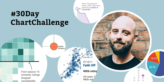
Family trees, heat maps, waffle charts — here’s what Cédric Scherer created for the #30DayChartChallenge
Investopedia: “Datawrapper is taking our content to the next level”
New York City Department of Health: “Datawrapper was the backbone of our COVID reporting”
KFF: “We are all-in on Datawrapper”
SWI swissinfo.ch: “Datawrapper is the perfect tool for our work”
London City Hall: “Datawrapper has sparked a change”
The Philadelphia Inquirer: “With Datawrapper, I bet on the right horse.”
You’ve informed the public with visualizations about the coronavirus. Thank you.
Aftenposten: “An article with a chart feels like a better article.”
Journalism professor Adam Marton: “The students don’t have any trouble picking it up.”
Statistics Flanders: “We want to reach everyone.”
New America: “Dammit, why didn’t we just pay for Datawrapper a year ago?”
Analyzing 100 years of election results in one chart
How to use the new Python library “datawrapper” to create 34 charts in a few seconds
Which chart types did our users create in 2019?
Why I created an R package to use Datawrapper’s API and how to use it
How we at n-tv used HTML to add custom color keys to Datawrapper charts & tables
A very complicated simple range plot
Pulling politicians together, with stiff & flexible springs
Shares as position & color
Which chart types did our users create in 2018?
The rise of the Chinese tourist is the rise of a confident red line
A bar chart made of dots
Line charts for distributions, not time
Data visualization for sports business strategy
How IJBA trains visualization skills
How Kwantlen Polytechnic University trains data skills
Best Practice: The Guardian Data Blog