Climate vis All blog topics >
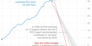
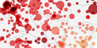
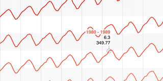
Data visualizations created with Datawrapper that help us (and hopefully you) to understand global warming and what humanity can do against it.
How do we use the Earth’s land?
Where would Germany be without Fukushima?
A fair way (or four) to look at global carbon emissions
No more white Christmas?
Trains versus planes
The case for speed limits
What is driving our carbon emissions and what to do about it
In the climate crisis, vulnerable countries bear the least responsibility
Is the Rhine drying up?
Cloudy climate… with a chance of meatballs
We are pushing the planet over the edge
The true cost of driving
A heatmap for the cool fall days
The climate crisis inside our heads
When will Europe phase out coal?
Days with extreme heat are likely becoming more frequent
By 2037, human-made materials will outweigh all living things on Earth
How much hotter will it get in your lifetime?
A full month more above 20°C
A minimal chart about global warming for the hottest year on record
Winter wonderland
These scatter plots of heat and rain helped me understand our changing climate
Data Debate: Stop flying or become vegetarian? Part 2.
Data Debate: Stop flying or become vegetarian? Part 1.
Tomorrow’s weather in Datawrapper: A live-updating locator map
Putting daily temperature ranges in context
How to save the world while making people better off
A Scatter Plot about Rebellious Germans
What different degrees of global warming look like
Which milk has the smallest impact on the planet?
Nuclear power won’t help us to fight climate change.
The black dots that warm our planet
The rich are killing the planet
The only chart we should be looking at
Greenland’s ice is melting, but without an OMG moment
2018: The fourth hottest year. Compared to what?
Which European cities have gotten warmer? (Spoiler: All of them.)
The challenges of visualizing climate change
Carbon dioxide concentration over time