Ever looked a bar chart in the eye before?

Hi. This is Elana, I help those of you who write to us with Datawrapper problems and questions. Have one but didn’t think to ask? Write me! I’ll be more than happy to help :)
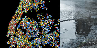
Today though I’m taking a little break from that to bring you another round of my personal Weekly ChART series (maybe you already saw my recreation of Vermeer’s Girl with a Pearl Earring as a scatterplot?).
Back when I used a scatterplot to recreate Vermeer’s painting, I lauded the scatterplot’s flexibility. That lent itself wonderfully to misuse to artistic ends.
Ever since then I’ve been asking myself, what about other chart types? Could they also be repurposed like this? Or do they pose too many constraints? No other chart type offers the same freedom in the placement and coloring of elements as the scatterplot does, so I needed to come up with a more creative way of translating pixels into data.
My solution? A split bar chart. A chart type more commonly used for making side by side comparisons of categorical data. Like this thought-provoking comparison of the different impacts milk and its alternatives have on the planet.
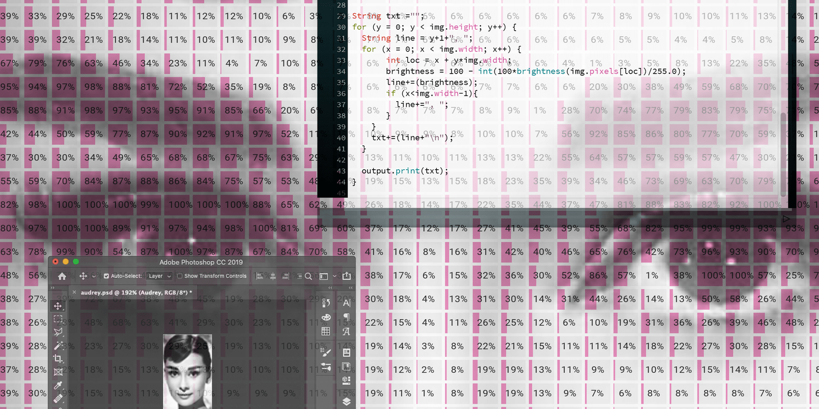
I chose to instead use the split bar chart to “compare” the brightness of the pixels of an image.
If you’ve never locked eyes with a bar chart before, now’s your chance.
![[aria-description]](https://datawrapper.dwcdn.net/8KImi/full.png)
So what’s going on here? Well, since our Datawrapper split bars only allow you to selectively color by row or by column, giving each individual bar a specific color was not an option.
This meant I needed to reduce the image down to just one visual variable. I chose the brightness. That’s what you see plotted above. Each bar represents the brightness (or more accurately “darkness”) of one pixel of the image. The darker the pixel, the more the bar is filled out.
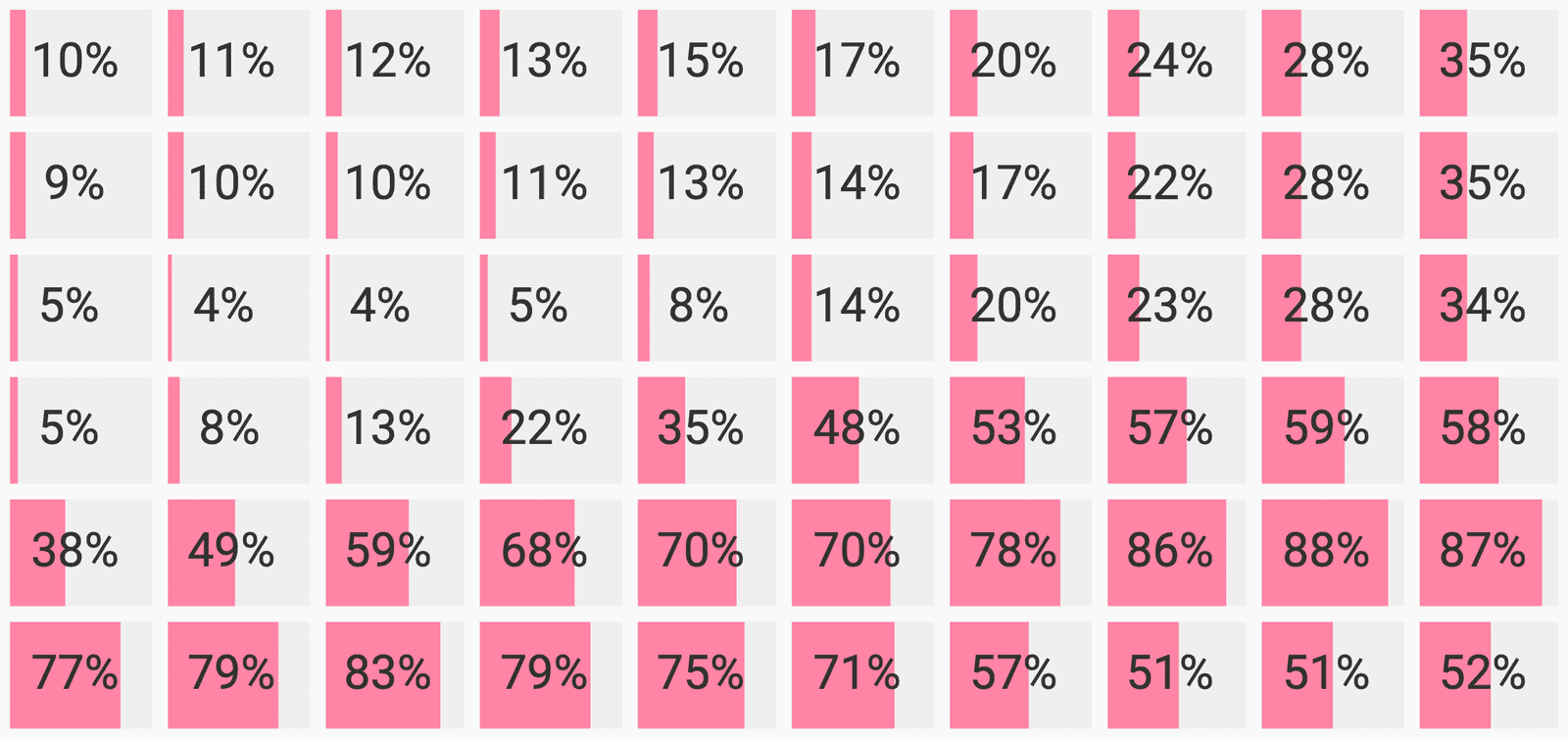
Columns 29 - 38
Rows 30 - 35
Now scroll back up to the chart, take a step back from your computer or phone and look at the chart from far away. See how your eyes start “averaging out” the colors of the bars, and the image regains an almost photographic quality?
Now take a few steps further back, and go talk to your friends. Or continue reading if you’re curious about the implementation details!
The nitty-gritty
The process was very similar to the one I documented in the scatterplot post, with a few additional considerations:
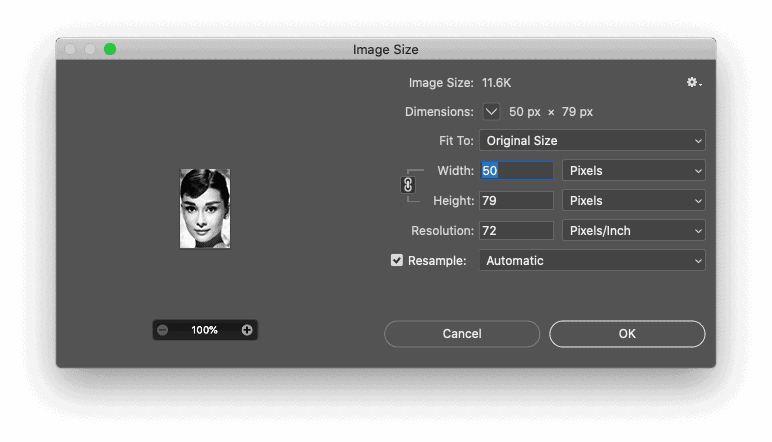
Resolution vs. Size. Unlike scatterplots, you can’t freely resize the height of a bar chart, because it’s constrained by the number of rows. The higher the resolution of the source image, the more rows it would need to have, and the bigger it would get. I decided 50px provided a reasonable resolution. But still, at its natural size of 1830px x 2460px the bar chart was pretty huge, so I had to cheat a little. The iframe above is scaled down to fit on the page. You can see the full-size version here.
Calculating brightness. I used Processing to loop through the pixels in the image, extracting the brightness of each one, calculating it as a percentage and then saving the value of 100 - brightness (i.e ‘darkness’) to a CSV. If you’re curious what the dataset looks like, you can see it here.
img.loadPixels();
int x,y,brightness;
String csv ="";

for (y = 0; y < img.height; y++) {
  String line = y+1+", ";
  for (x = 0; x < img.width; x++) {
     int loc = x + y*img.width;
     brightness = 100 - int(100*brightness(img.pixels[loc])/255.0);
     line+=(brightness);
     if (x-1) line+=", ";
  }
  csv+=(line+"n");
}
Making the chart. Now that I had generated a CSV with the numerical data, I simply pasted it into Datawrapper. I chose to hide the value labels, and I also customized the colors so that they were uniform. (Datawrapper automatically assigns different colors to the different columns in the dataset. Makes sense when your goal is to facilitate comparison between categories, but less so here!)
Alright that’s it! But before you go, here’s one more for good measure. Hover over it to reveal the full image chart.
![[aria-description]](https://datawrapper.dwcdn.net/Cnrf4/full.png)
That’s all for now! If you want to play with the bar chart in Datawrapper yourself, hover over the top right of the chart and click Edit this chart. And if you want to find out how you can make your own split bar chart in Datawrapper, visit this Academy article. Feedback, comments, suggestions? Let me know in the comments. Until next time!