Color in data vis All blog topics >
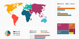
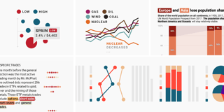
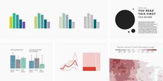
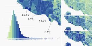
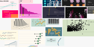
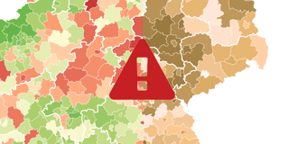
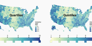
Using beautiful, legible colors can be hard. We’re here to help. Here’s how to use better colors in your charts and maps.
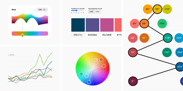
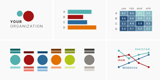
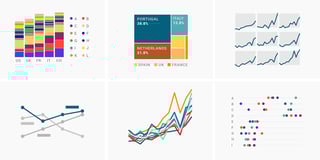
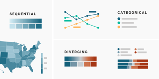
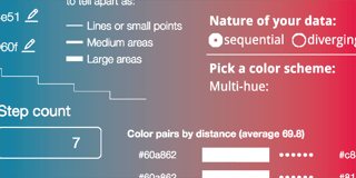
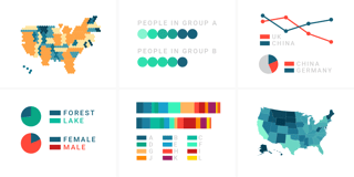
How to find & create good color palettes
What to consider when choosing colors for race, ethnicity, and world regions
Remind readers of the colors in your data visualization
How to design a useful (and fun!) color key for your data visualization
Emphasize what you want readers to see with color
How to choose an interpolation for your color scale
What background color should your data vis have?
A detailed guide to colors in data vis style guides
10 ways to use fewer colors in your data visualizations
Watch Lisa write our book on how to use colors in data vis
Which color scale to use when visualizing data
When to use quantitative and when to use qualitative color scales
When to use sequential and when to use diverging color scales
When to use classed and when to use unclassed color scales
How to pick more beautiful colors for your data visualizations
What’s it like to be colorblind
What to consider when visualizing data for colorblind readers
How your colorblind and colorweak readers see your colors
Shares as position & color
Election reporting: Which color for which party?
Your friendly guide to colors in data visualisation
An alternative to pink & blue: Colors for gender data
What to consider when choosing colors for data visualization
Datawrapper now checks your colors, so you don’t have to
How to choose a color palette for choropleth maps