The best of last week’s big and small data visualizations
Lisa Charlotte Muth
Welcome back to the 12th edition of Data Vis Dispatch! Every week, we’ll be publishing a collection of the best small and large data visualizations we find, especially from news organizations — to celebrate data journalism, data visualization, simple charts, elaborate maps, and their creators.
Recurring topics this week include COVID-19 hospitalizations and vaccinations, the rainfall records broken by Ida in the U.S., and the German elections:
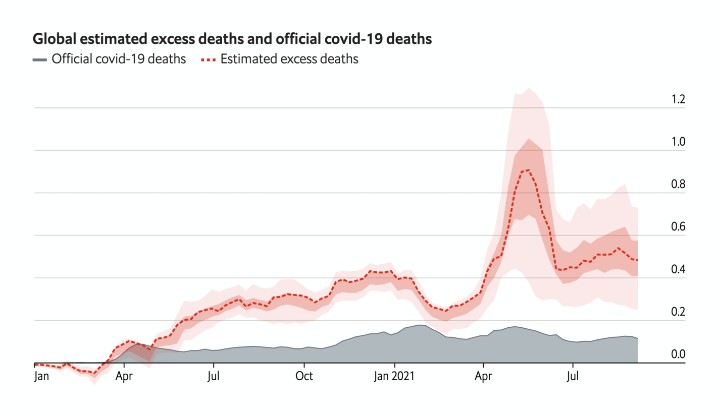
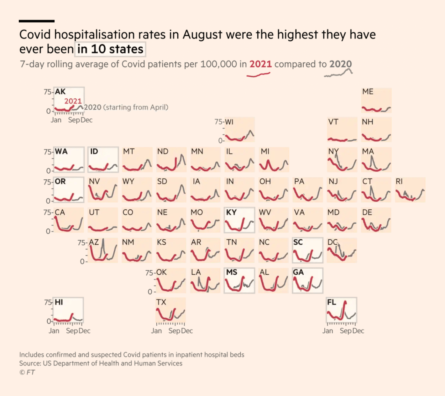
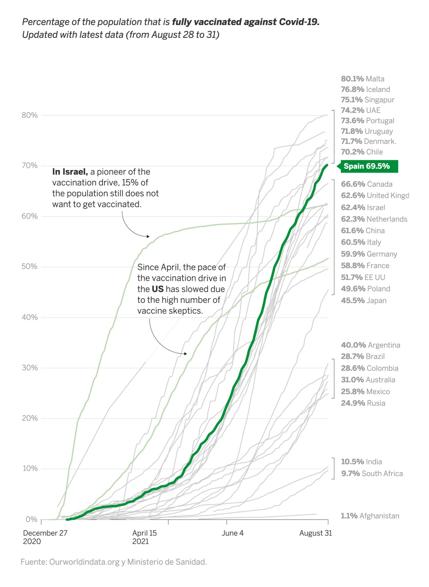
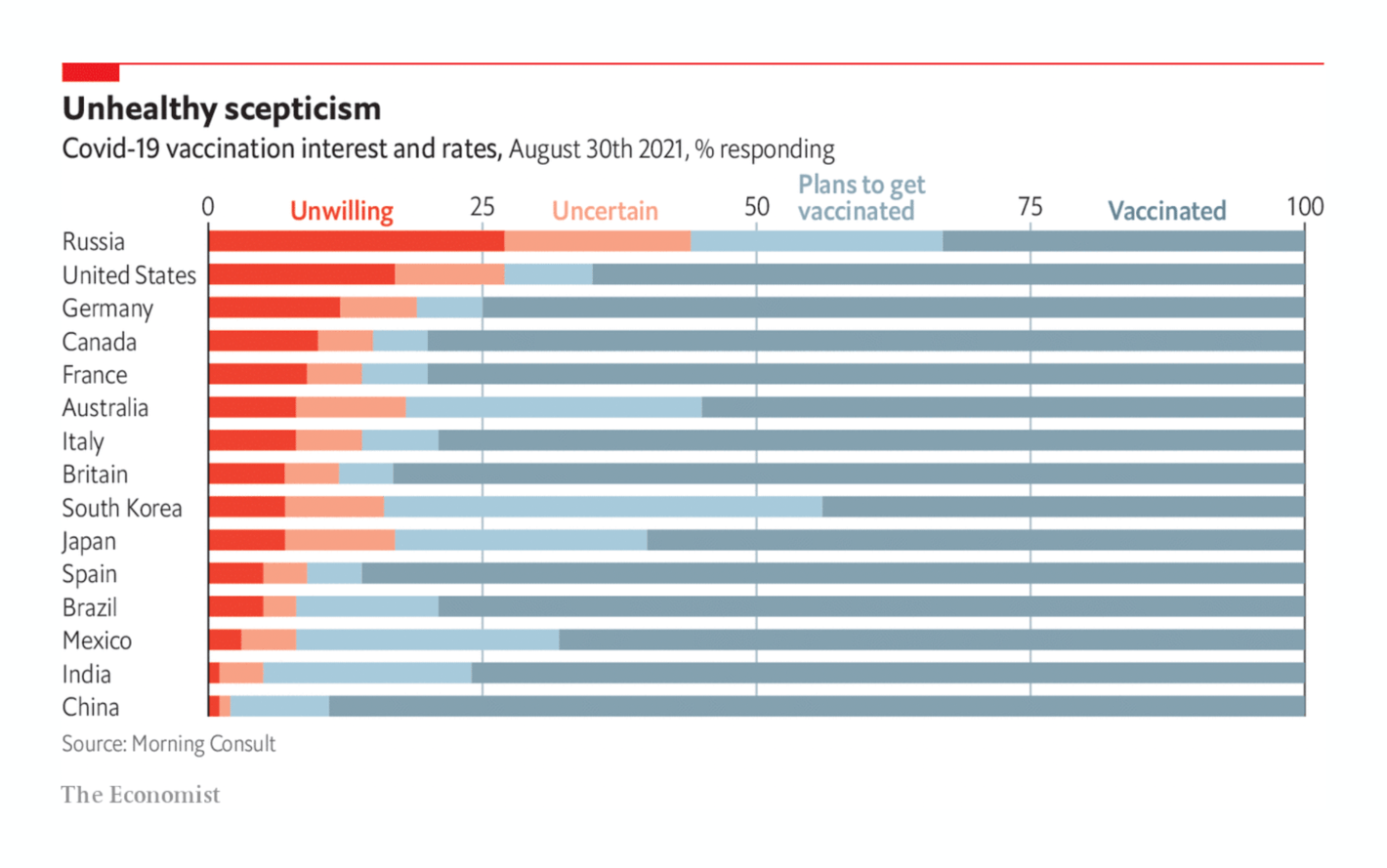
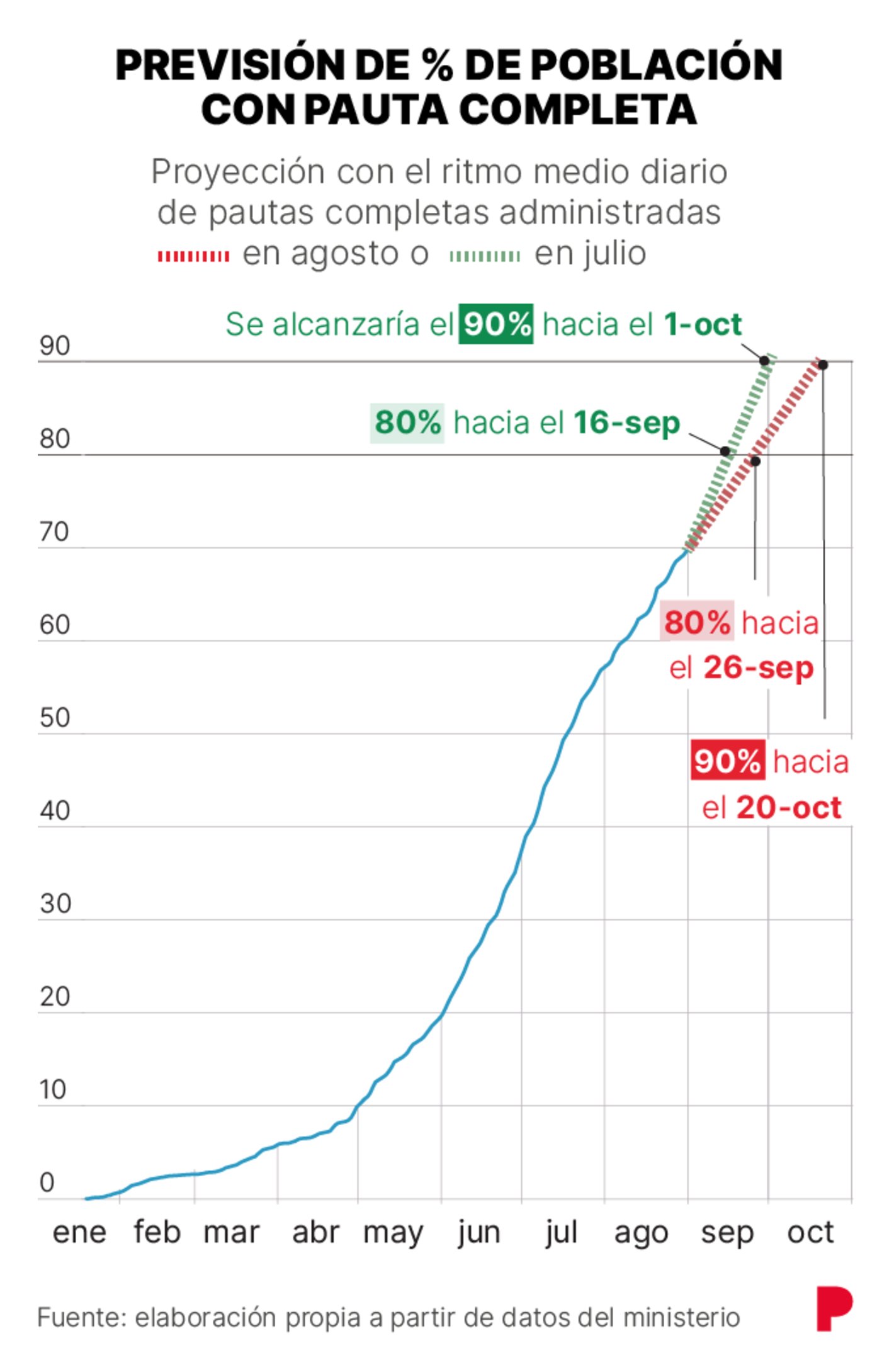
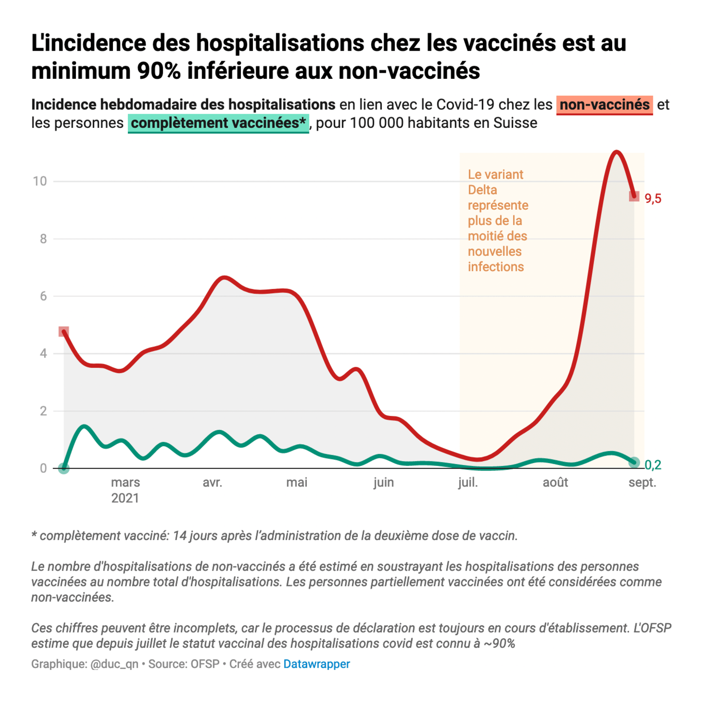
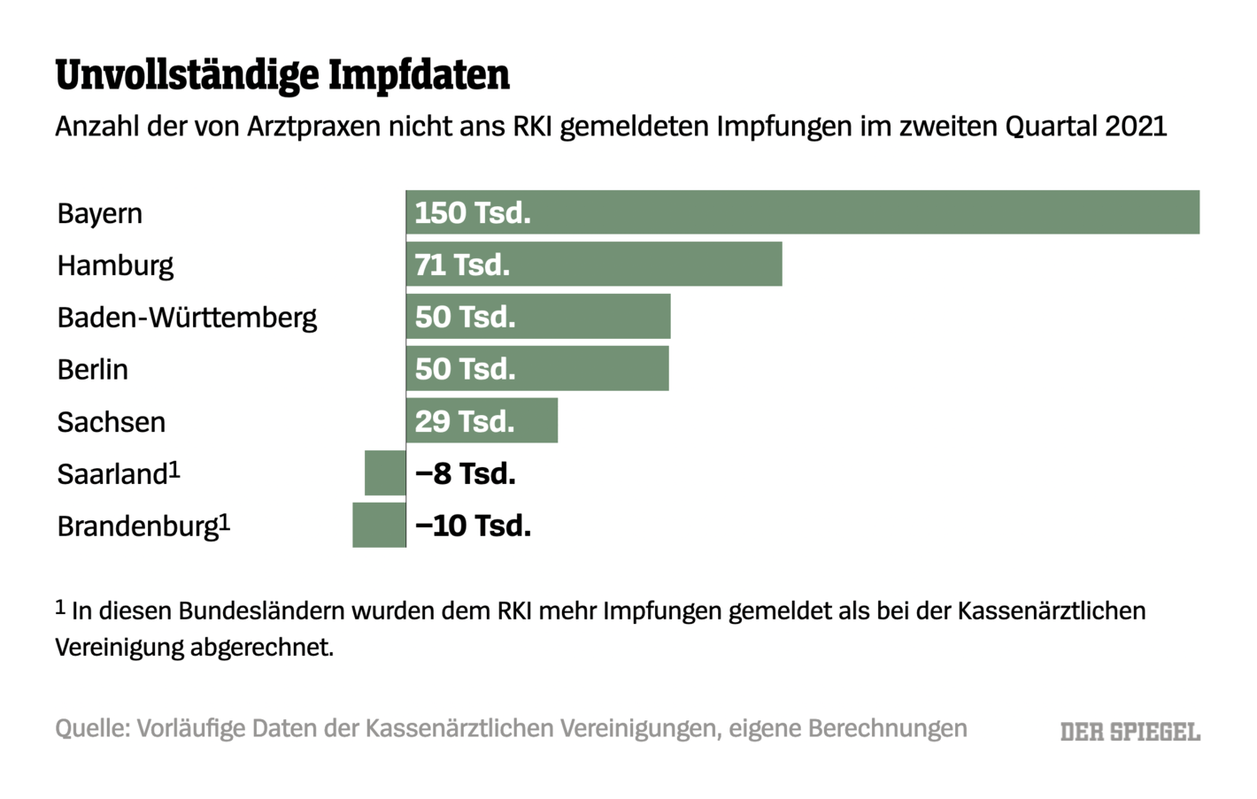
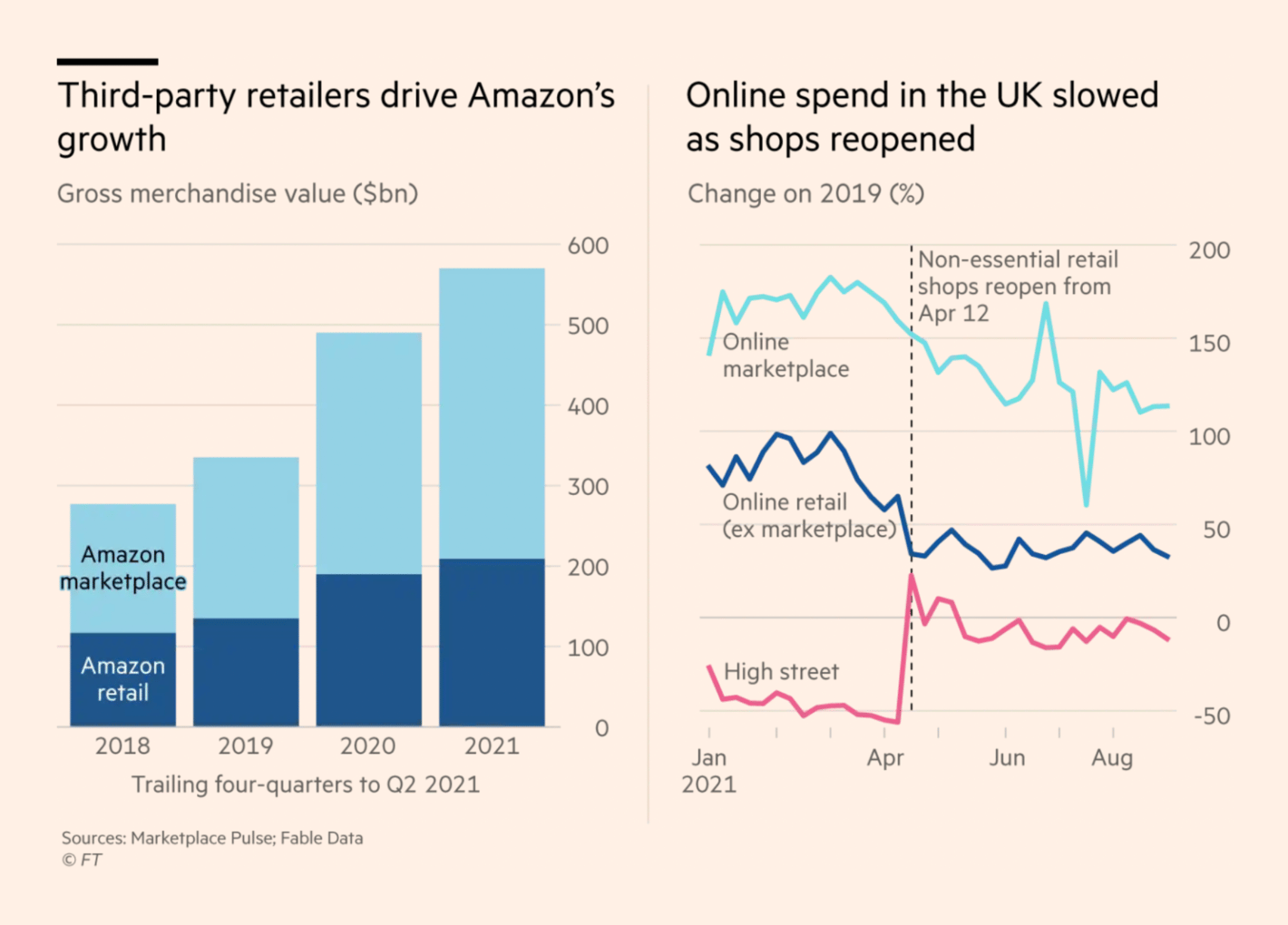
First, COVID-19. In the past week, we got a frightening new estimation of excess deaths in the past two years, higher-than-ever hospitalization numbers in some U.S. states, and 350,000 unreported vaccinations in Germany:
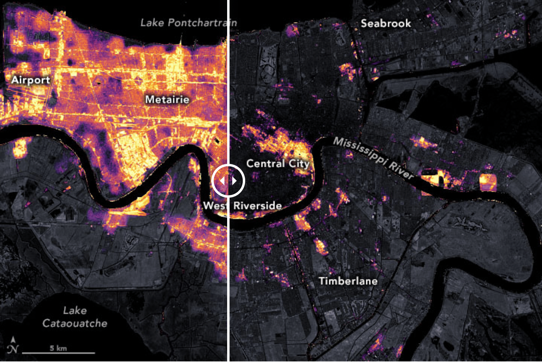
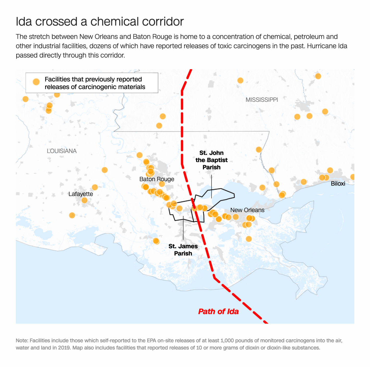
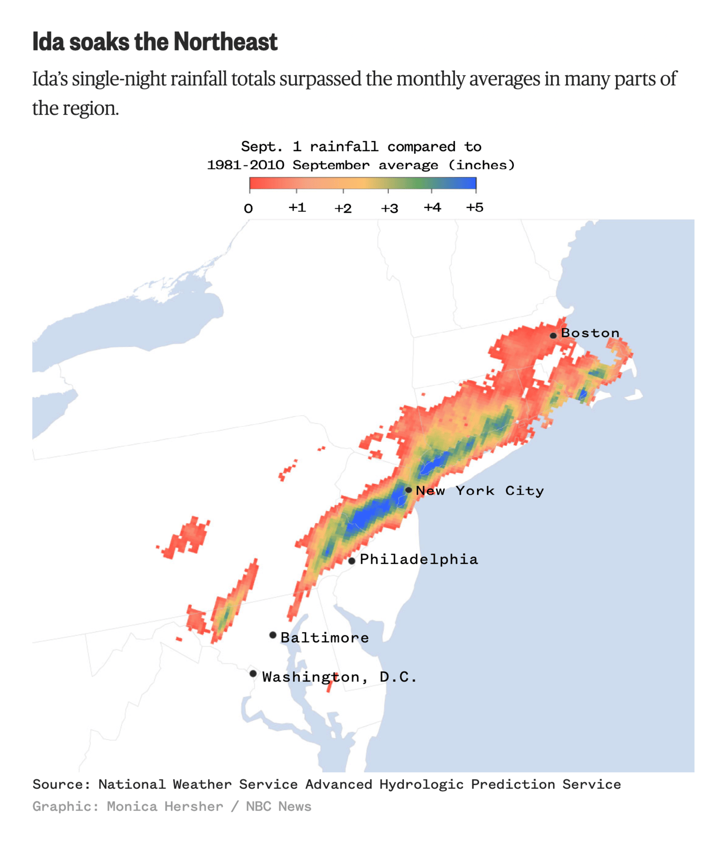
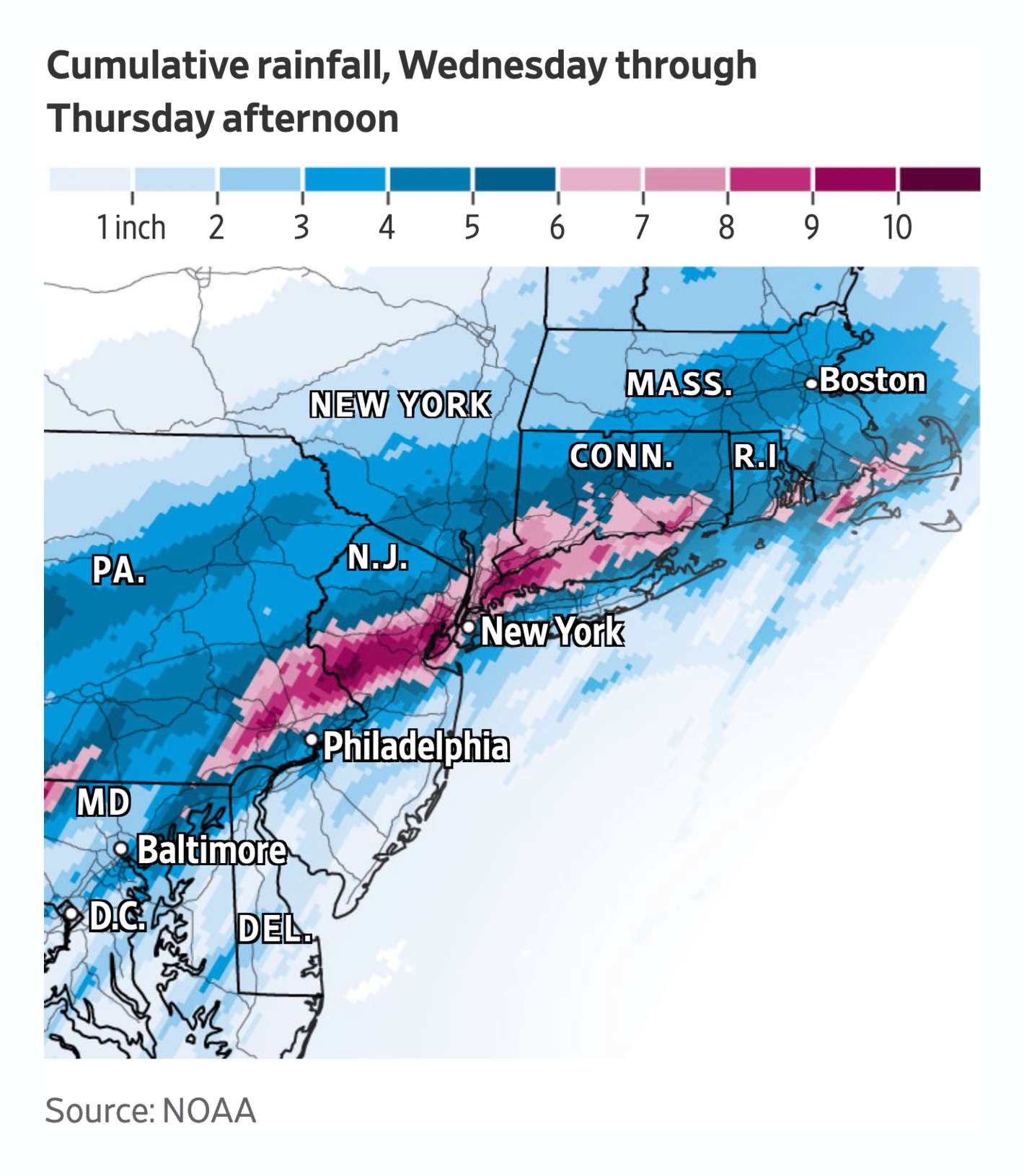
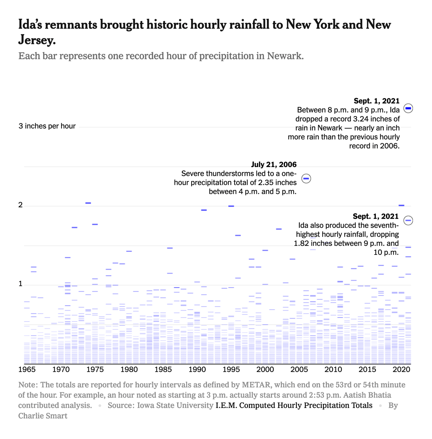
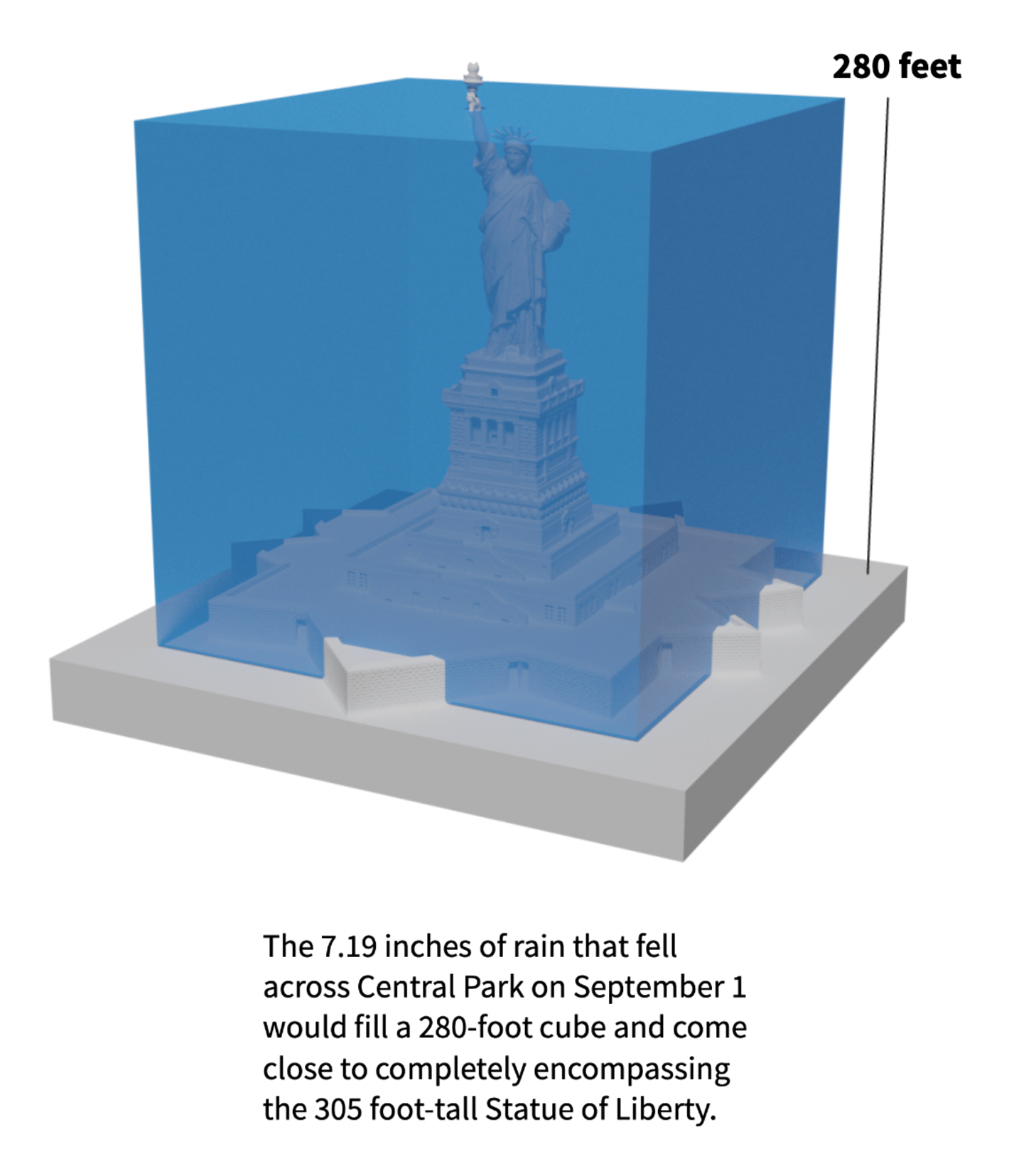
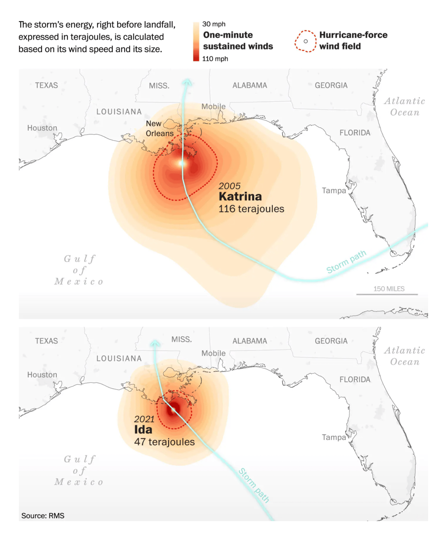
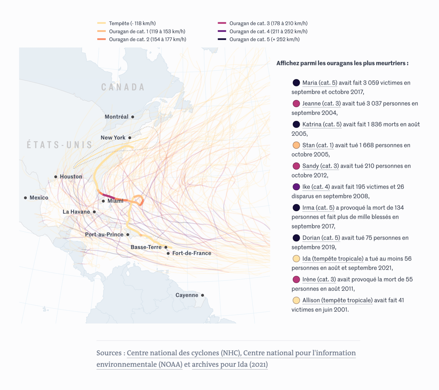
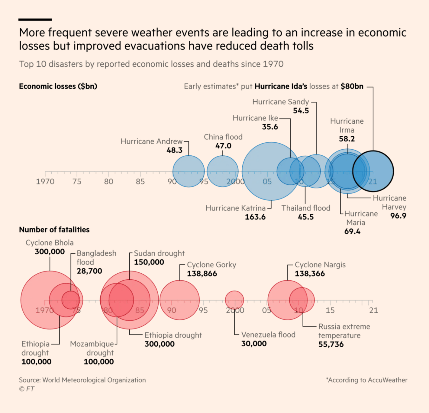
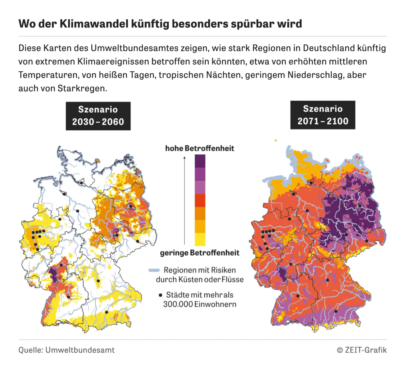
The week was also full of climate and weather visualizations. After Hurricane Ida passed Louisiana — leading to devastation and power outages — it moved north and broke new records:
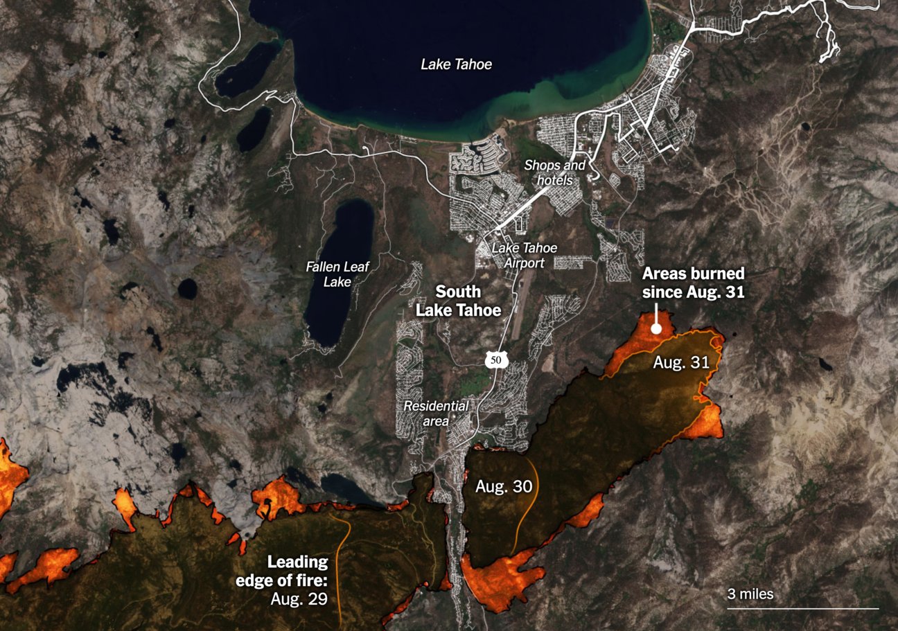
In other parts of the U.S., the fires continue, making journalists ask: Is this the new normal? How does (or will) the climate catastrophe affect our lives?
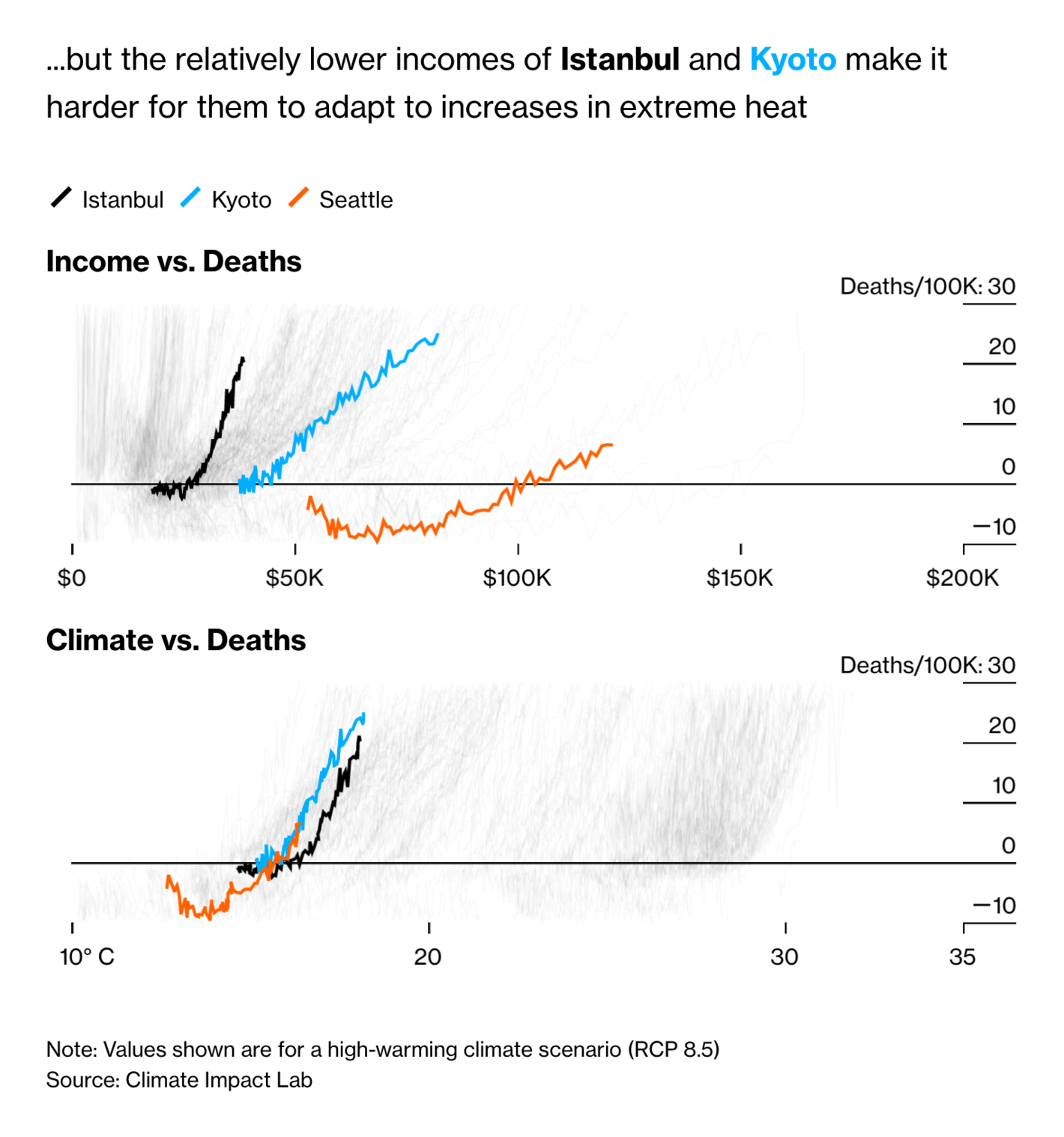
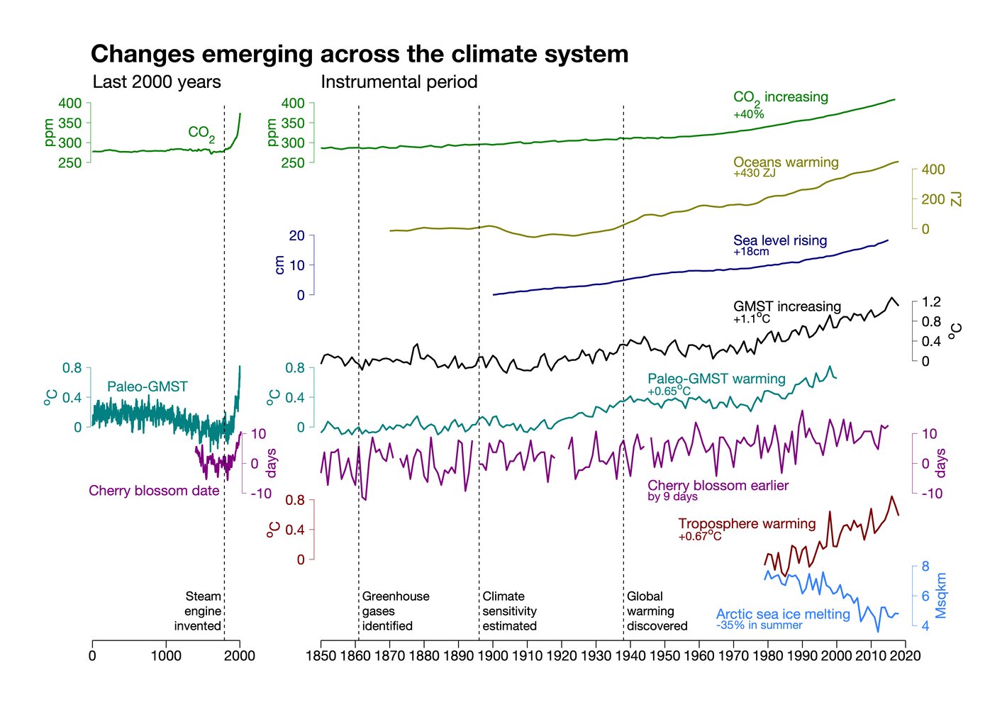
To understand and communicate climate change, researchers, journalists, and designers are always finding new ways of visualizing it. A new book collects these visualizations — while Ed Hawkins (inventor of the warming stripes) tries to bring all climate indicators together in one chart:
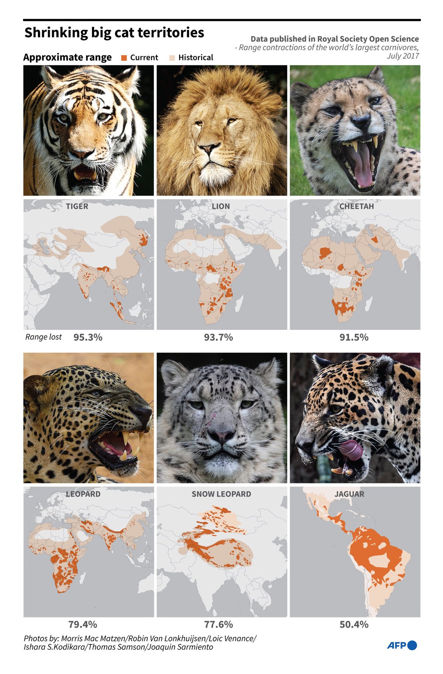
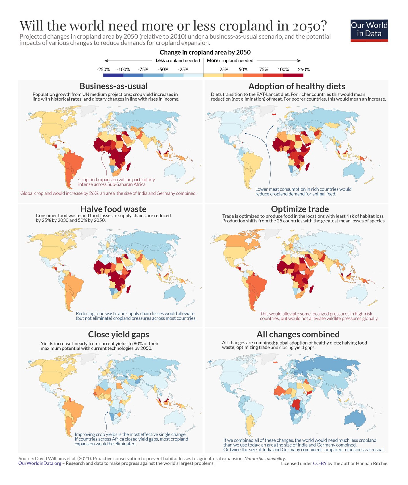
And we're not done yet with environmental problems: Wildlife is losing its habitat. To save animal species, we must improve crop yields, writes Hannah Ritchie from Our World in Data:
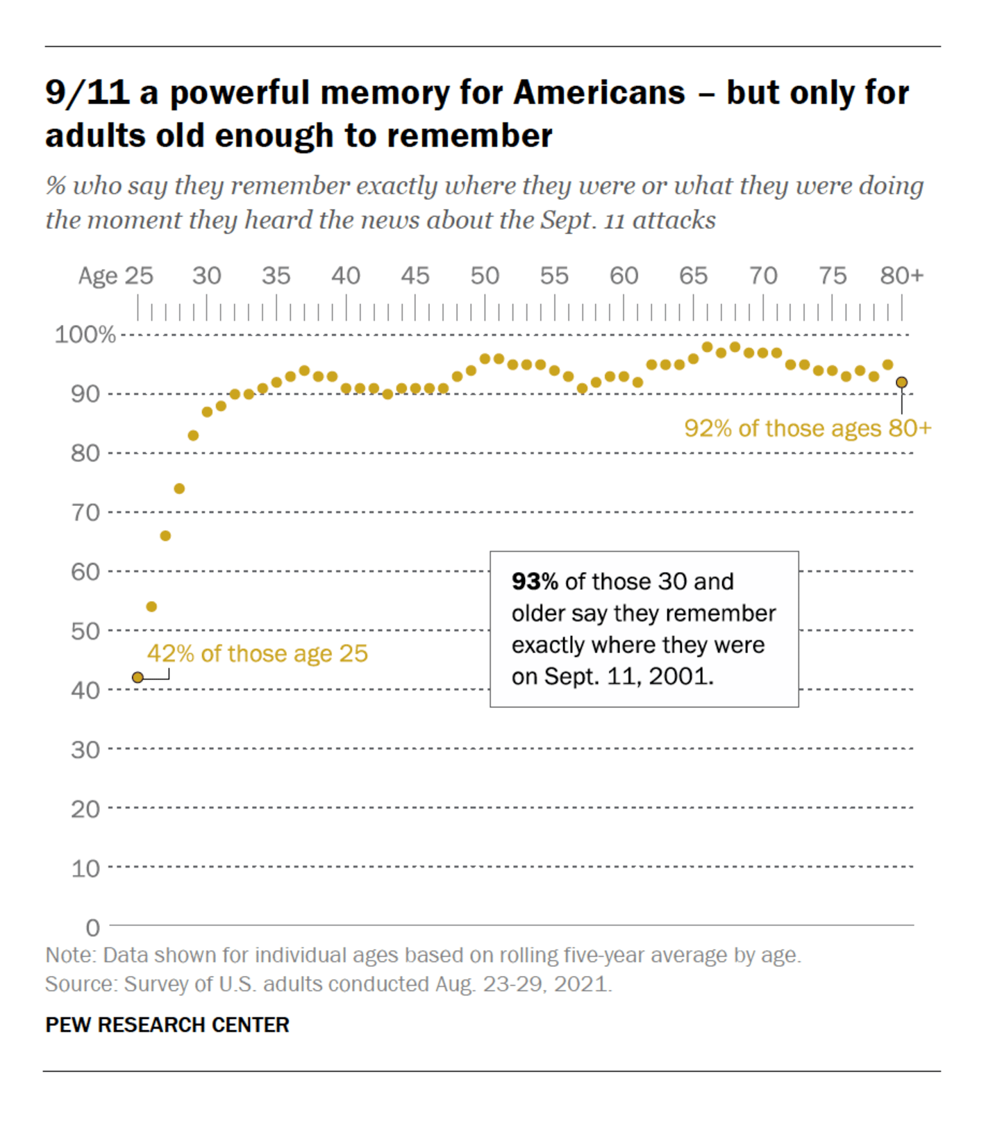
And with the 20th anniversary of 9/11 attacks around the corner, the first newsrooms have published articles that explore how this event changed New York City and U.S. politics. We can expect more of that this and next week.
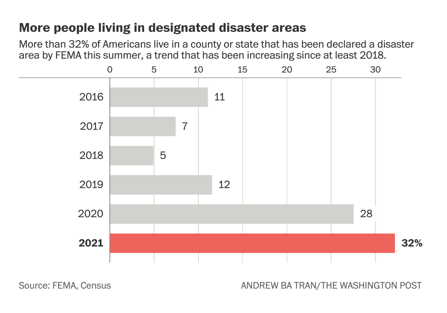
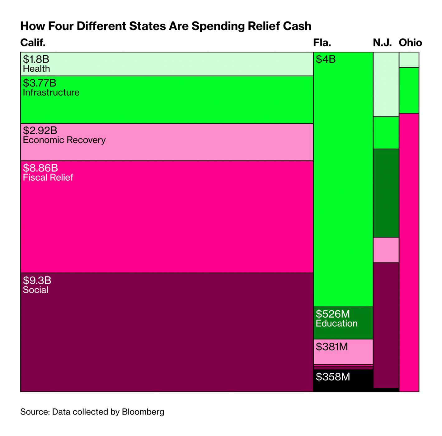
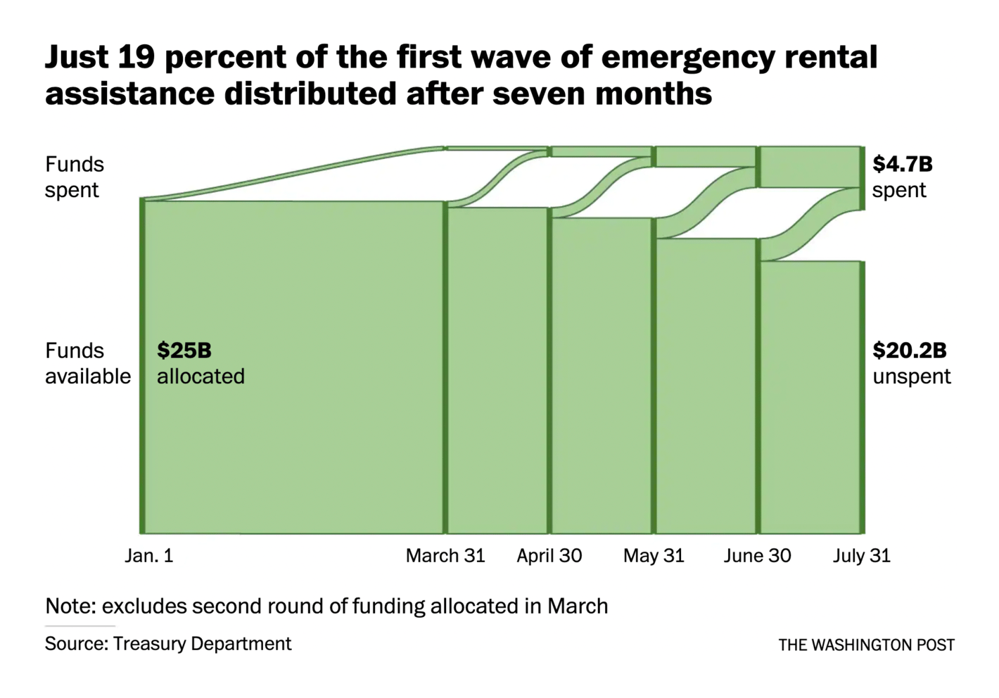
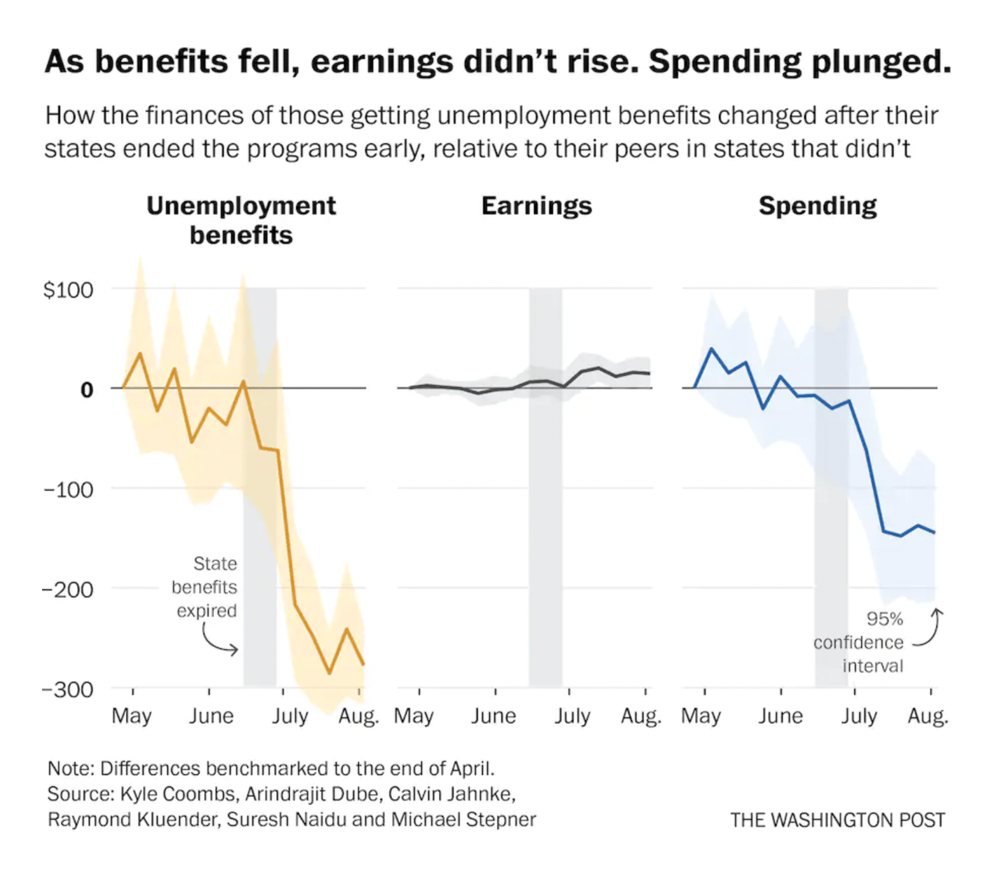
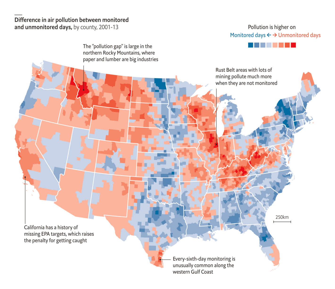
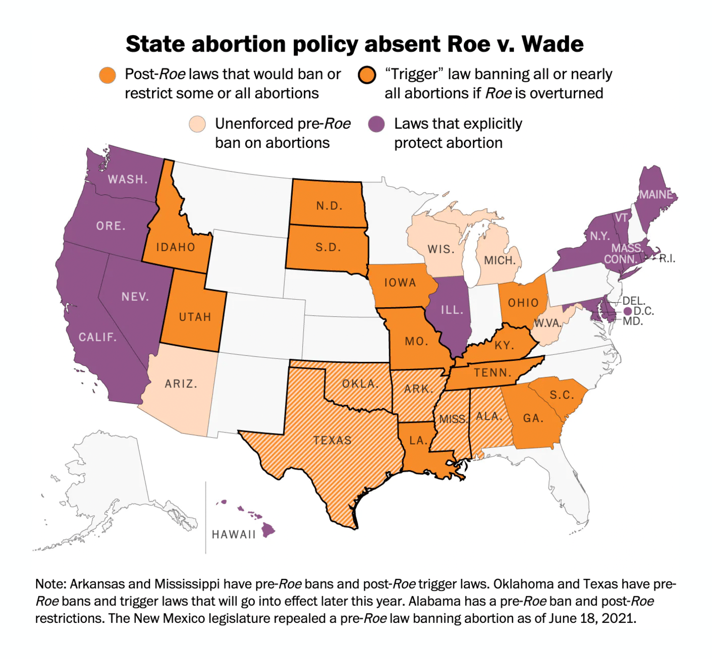
U.S. newsrooms were also busy visualizing the effect of changing policies — rental aid, unemployment benefits, pollution regulations, abortion laws, and more:
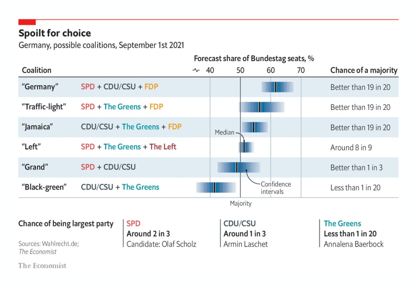
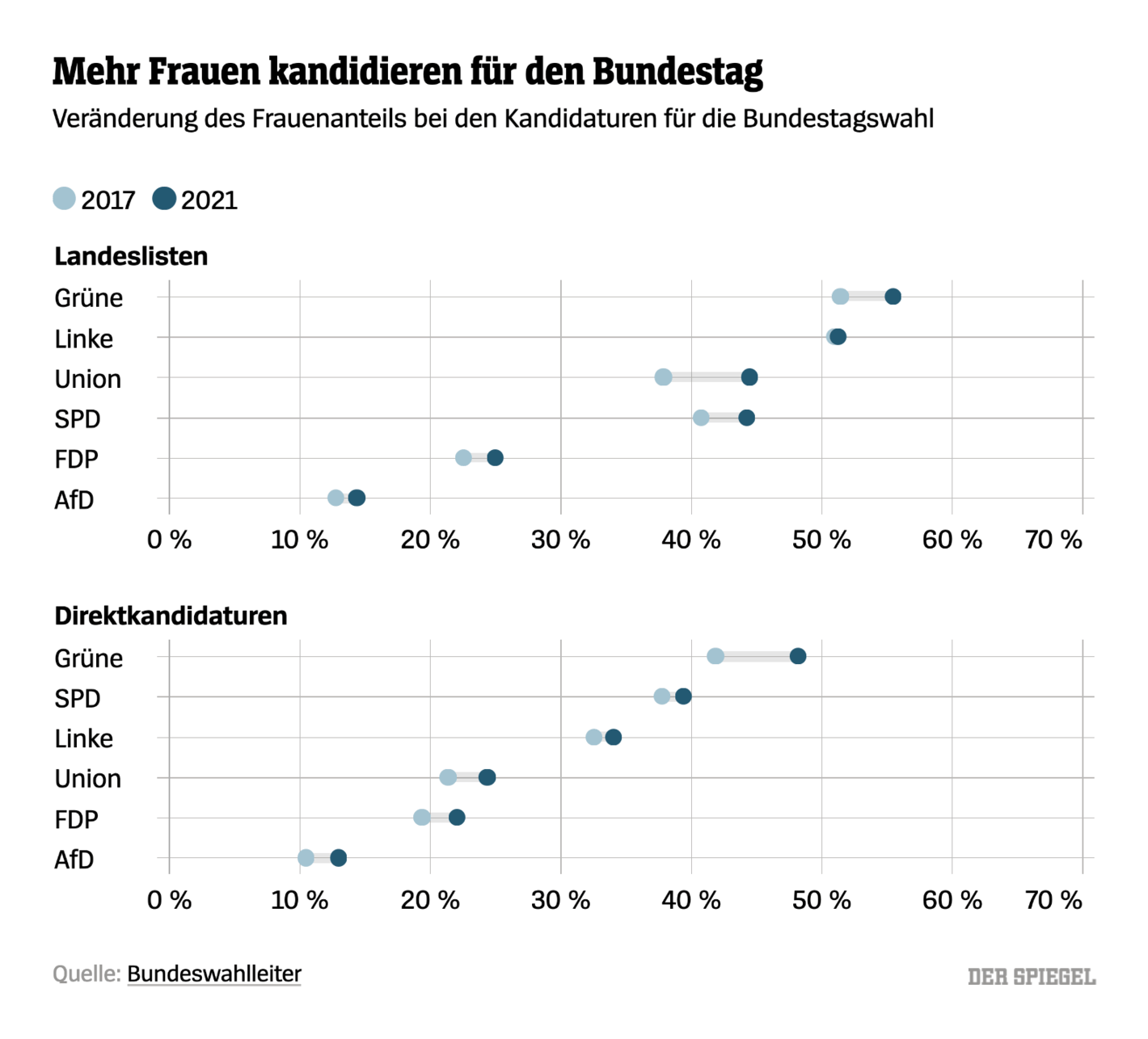
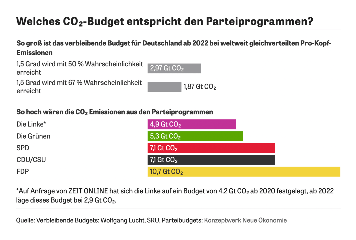
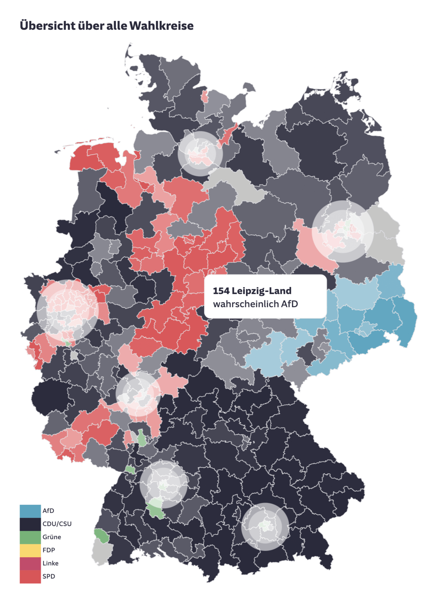
And last but not least: Polls for the German federal election on September 26 continue to show all kinds of crazy possible election results. German newsrooms looked at campaign promises and election candidates:
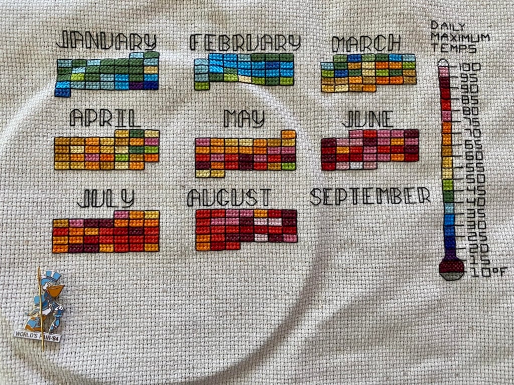
Jason Forrest: "This article on massive cattle farms [in the Fortune Magazine from December 1933] has some amazing maps. Completely vivid and exotically detailed... The lettering and icons are wonderful, each detail adds opt-in information despite not needing to do so." (Tweet)Yvette Cendes: "I’ve been cross stitching the daily high temperatures in the Boston area this year, and heard you all might like to see what I have so far!," September 3 (Reddit, Tweet)にゃんこそば: "日本国内で「人が住んでいるところ」を光らせてみた。" [I tried to visualize 'where people live' in Japan.], September 3 (Tweet)William Mapan: "Tangible components — End of the mini series, where I wanted to explore more physical painting driven by procedural sketches and anchor it in the real world through stop motion," September 4 (Tweet)The New York Times: The Surfside Condo Was Flawed and Failing. Here’s a Look Inside, September 1Global Initiative, Resilience Fund, Kontinentalist: A place called disappeared, September 1
The Dutch data vis conference S-H-O-W is happening on November 10 and 11 under the theme "ENCORE" and with great speakers. You can follow along online. Get your ticket here.
Help us make this dispatch better! We'd love to hear which newsletters, blogs, or social media accounts we need to follow to learn about interesting projects, especially from less-covered parts of the world (Asia, South America, Africa). Write us at hello@datawrapper.de or leave a comment below.


![Jason Forrest: "This article on massive cattle farms [in the Fortune Magazine from December 1933] has some amazing maps. Completely vivid and exotically detailed... The lettering and icons are wonderful, each detail adds opt-in information despite not needing to do so." (<a href="https://twitter.com/Jasonforrestftw/status/1433566425143287809"><strong>Tweet</strong></a>)](https://datawrapper.de/cdn-cgi/image/quality=85,width=1899,f=auto,fit=cover/https://kirby.datawrapper.de/media/pages/blog/data-vis-dispatch-september-7-2021/5ad5239a12-1740123128/E-UNDb3XIAEaQN6.jpg)
![にゃんこそば: "日本国内で「人が住んでいるところ」を光らせてみた。" [I tried to visualize 'where people live' in Japan.], September 3 (<a href="https://twitter.com/ShinagawaJP/status/1433769159859392515"><strong>Tweet</strong></a>)](https://datawrapper.de/cdn-cgi/image/quality=85,width=1420,f=auto,fit=cover/https://kirby.datawrapper.de/media/pages/blog/data-vis-dispatch-september-7-2021/8f212ccba7-1740123129/nice27.png)