The best of last week’s big and small data visualizations
Vivien Serve
Welcome back to the 119th edition of Data Vis Dispatch! Every week, we’ll be publishing a collection of the best small and large data visualizations we find, especially from news organizations — to celebrate data journalism, data visualization, simple charts, elaborate maps, and their creators.
Recurring topics this week include the deep ocean, the broad universe and the beauty of music.
It's the third week of November, which means round three of our #30DayMapChallenge favorites:
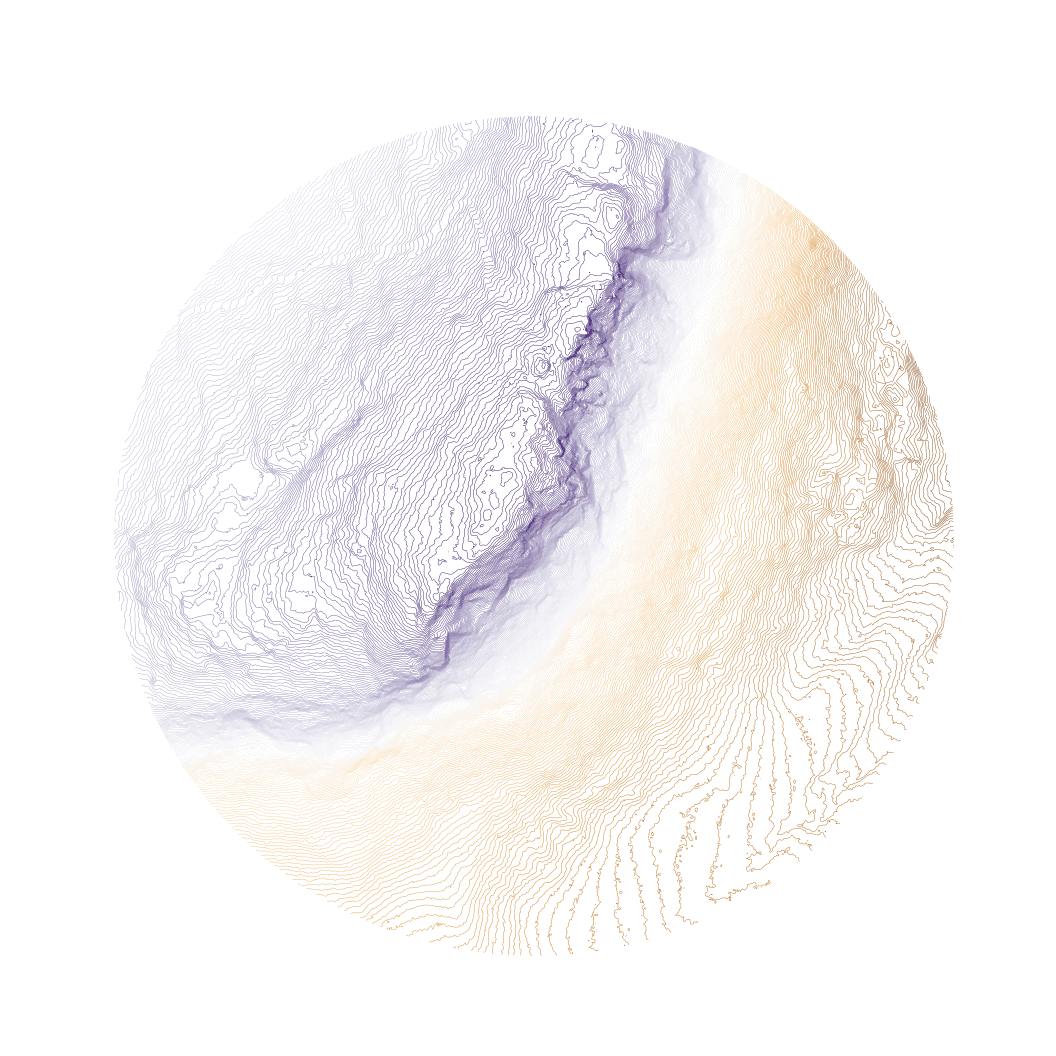
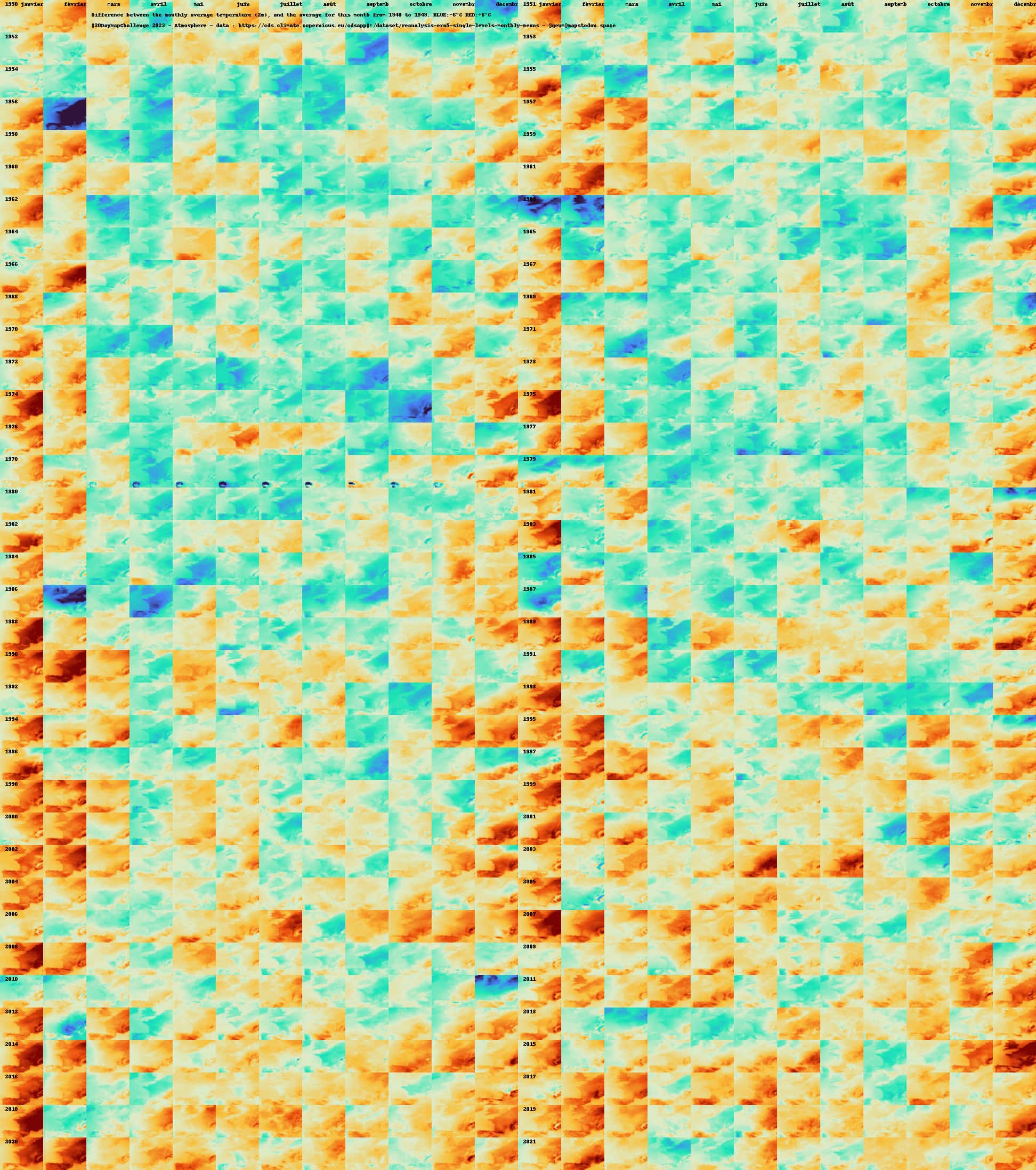
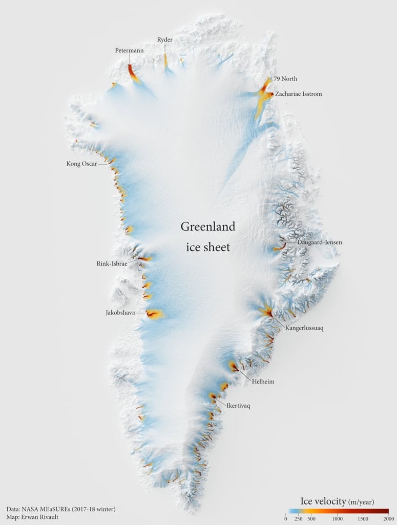
Bill: "Day 20 of the #30DayMapChallenge - "Outdoors". Wheeler mountain in the Northeast Kingdom of #vermont is a granite batholith in a glacially-scoured landscape. It's also where I learned to rock climb as a hairy young man. As such, I made a simple plot of its contours, rising up from a small valley below.," November 20 (Mastodon Post)Antonia Blankenberg: "#30DayMapChallenge Day 20: Outdoors Another great dataset here from @LivingAtlas showing terrestrial species richness patterns. Bonus points if you can see where the amphibians are - it's not a huge area!," November 20 (Tweet)Geum Pyrenaicum: "#30DayMapChallenge jour 18 : Atmosphère. Comparaison des températures mensuelles avec la période 1940-1949 (du même mois), sur la France. Palette de -6° à +6°C. L'hiver 56 en haut à gauche, celui de 86 plus bas. Un réchauffement progressif, plutôt hivernal, au moins par rapport aux années 40 retenues.," November 18 (Mastodon Post) Kai Sonder: "30DayMapChallenge: Day 18 Atmosphere Nothing to see here, move on. CO2 Emissions (kgC/d) on one day in 2021 GRACED Dou et al., 2023," November 18 (Tweet)Erwan Rivault: "#30DayMapChallenge Day 17: Flow Visualising the flow of ice in Greenland," November 17 (Tweet)
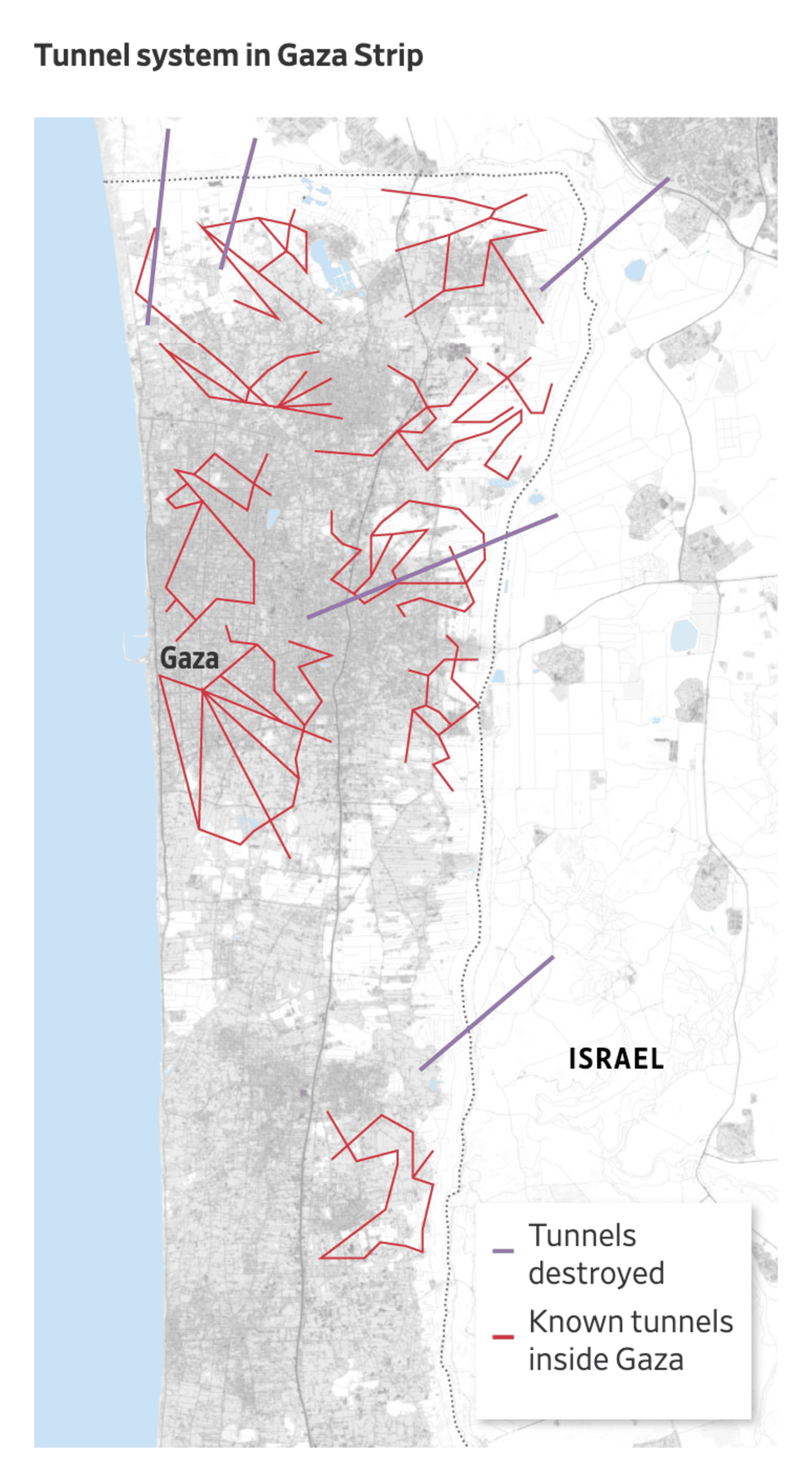
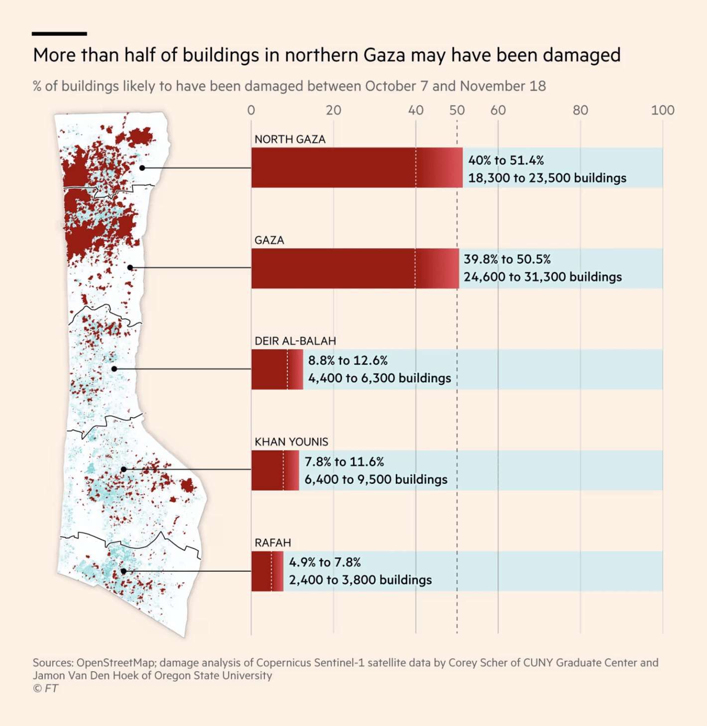
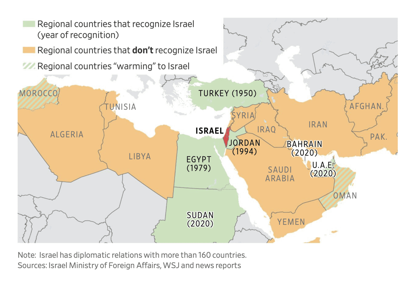
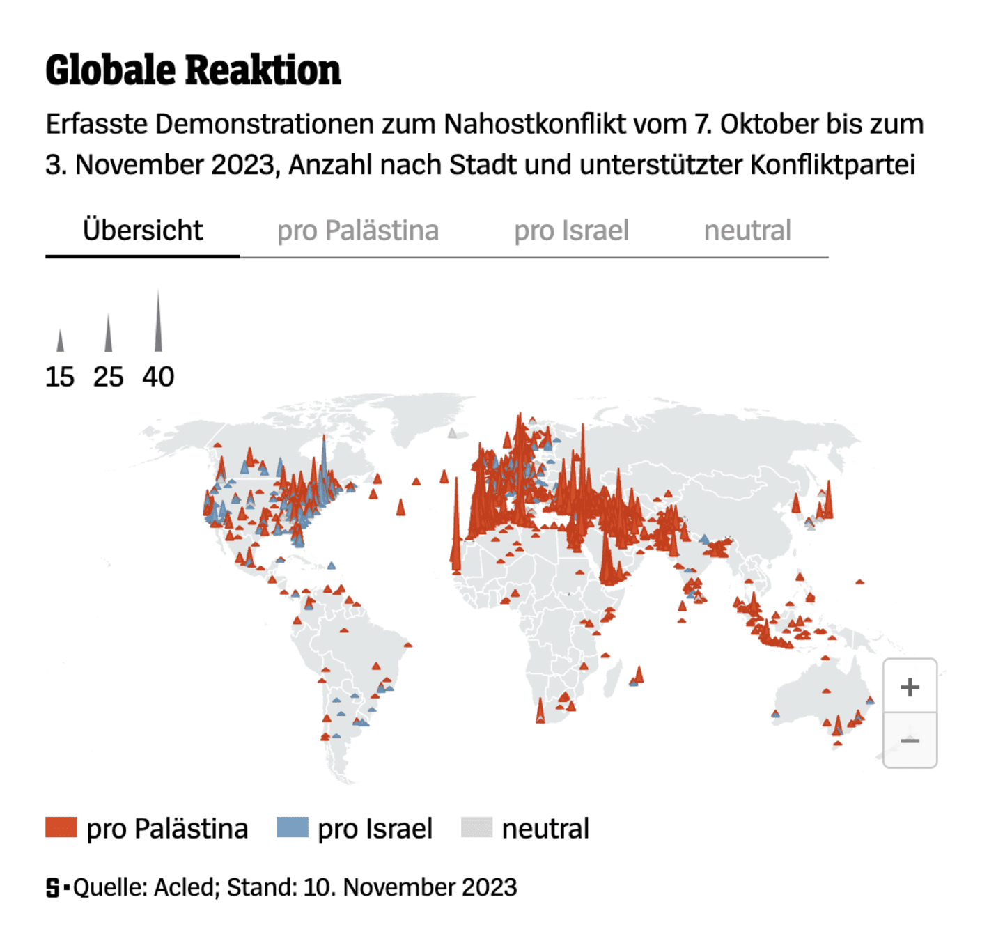
Back to the topic that generated the most data visualizations this week: the ongoing military activity between Israel and Hamas. There were several maps showing the Gaza Strip itself, the Hamas tunnels, but also the damaged infrastructure in major cities:
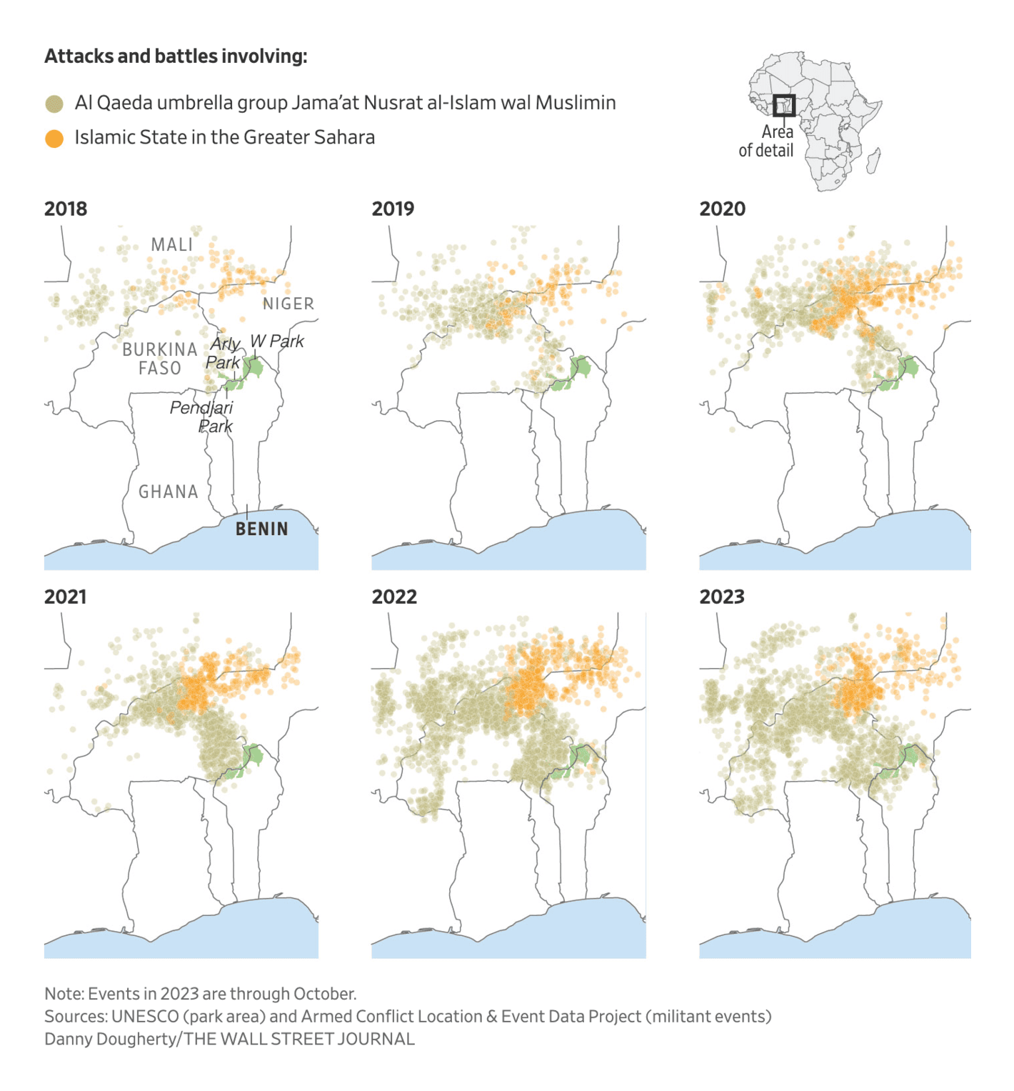
Despite the focus on the war between Israel and Hamas, other military operations and battles lead to visualizations,l too. For Africa in particular, we found maps depicting the U.S. battles with Al Qaeda and Islamic State, as well as the affairs of the Wagner Group:
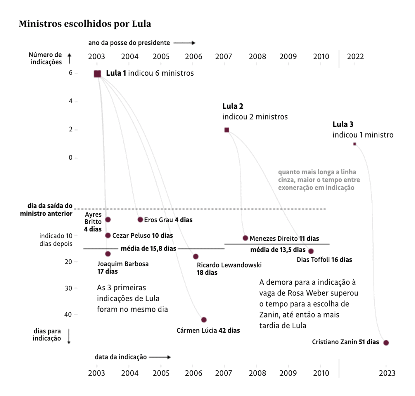
Last but not least from the world of politics: government formation. Pedro Sánchez is sworn in as president of the Spanish government and chooses his ministers. So does the President of Brazil, Lula da Silva:
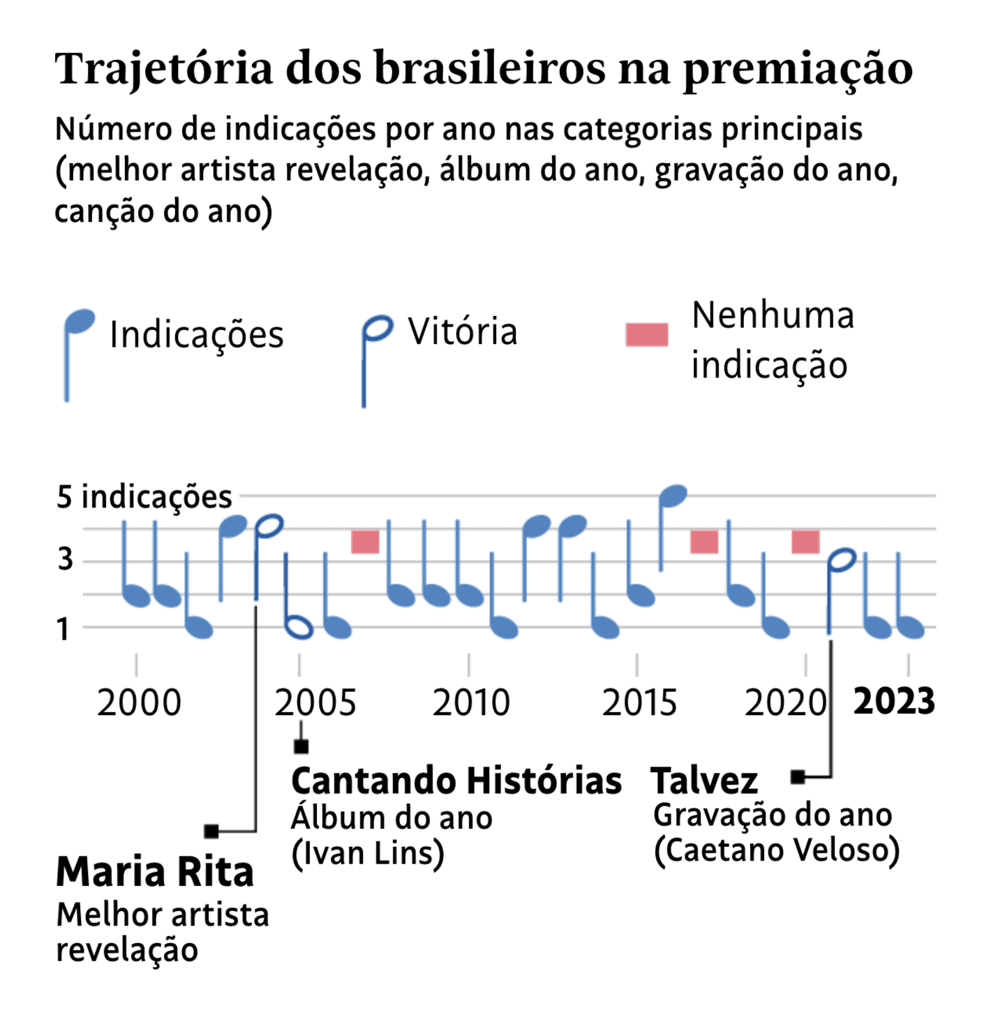
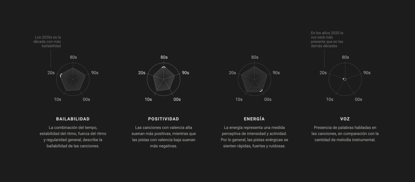
“Music expresses that which cannot be put into words.” — Victor Hugo “Visualizations about music express that which cannot be put into words about music” — Us
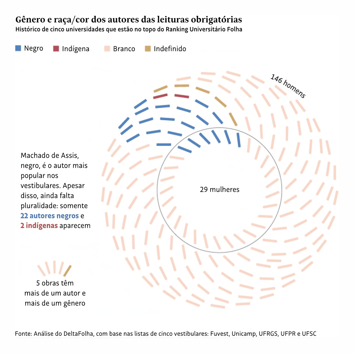
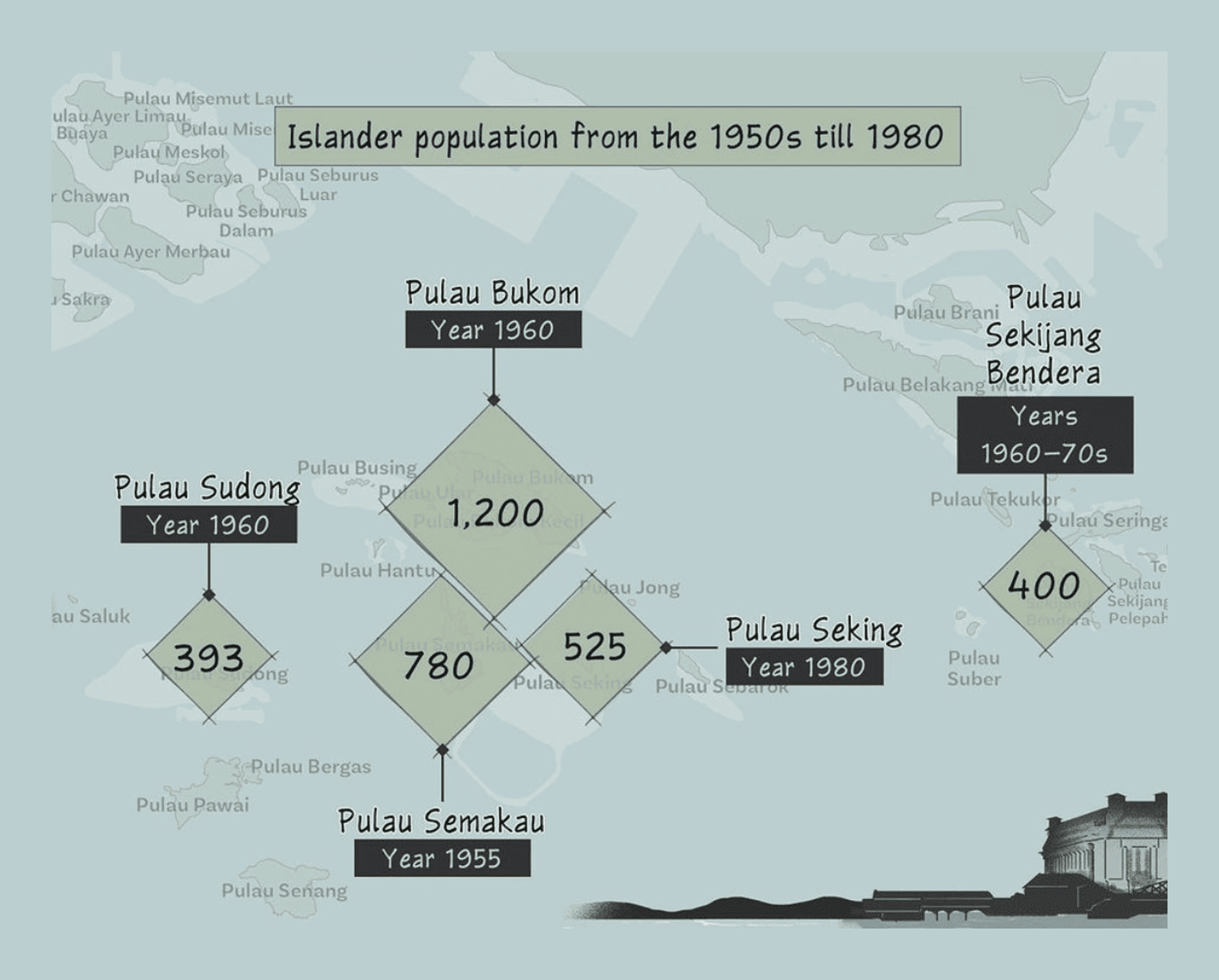
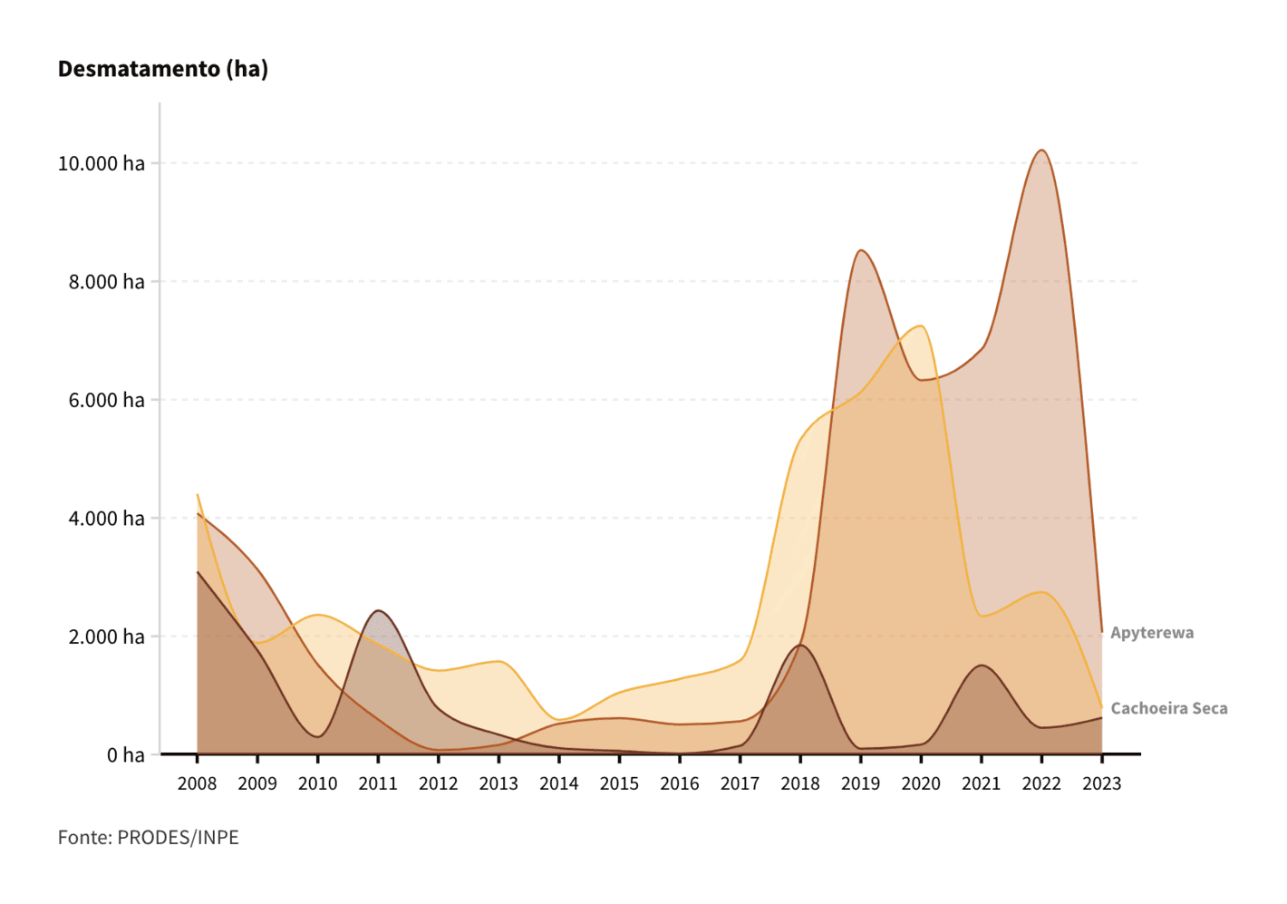
What is the common factor when we talk about the history of Singapore and the reduction of deforestation in South America? Exactly: Indigenous people.
Kontinentalist: "Singapore is known as an island nation, but in reality it is an archipelago of islands with close ties to other parts of the Nusantara region. The transformation of these islands and the displacement of former inhabitants have only deepened this knowledge gap of the country’s history. Old indigenous names have given way to new ones, while some islands no longer exist.," (Instagram Post)InfoAmazonia: Terras indígenas têm redução de mais de 50% no desmatamento em 2023, November 14
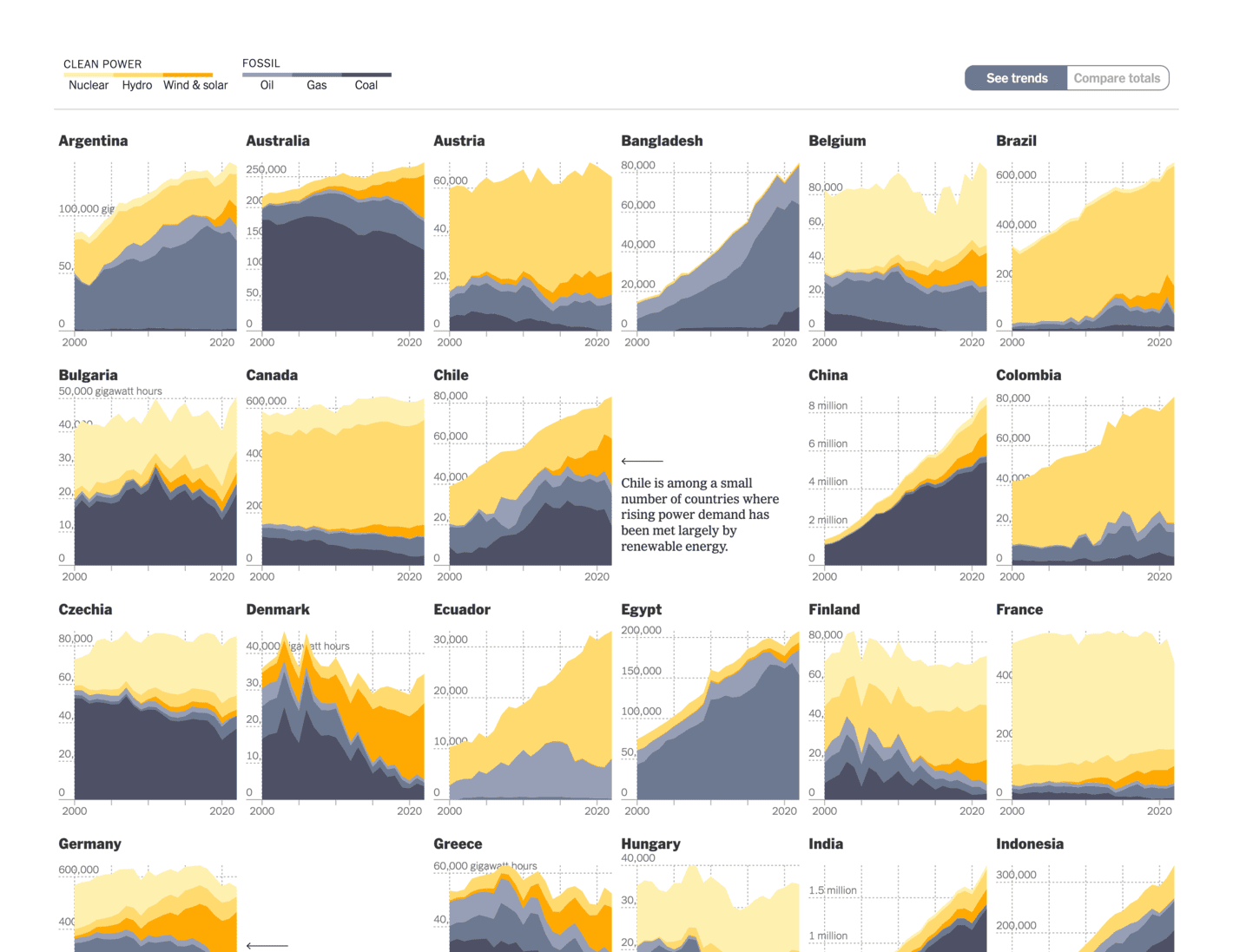
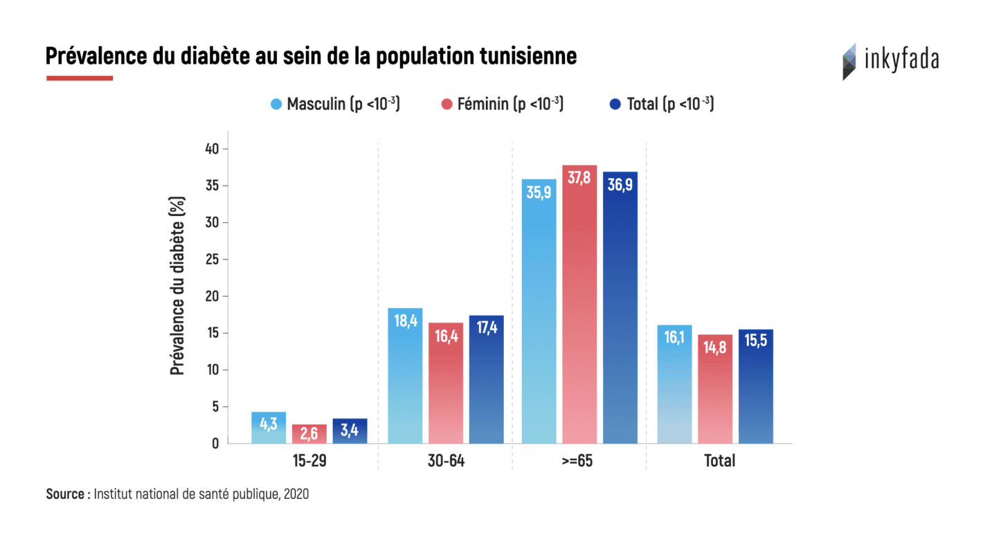
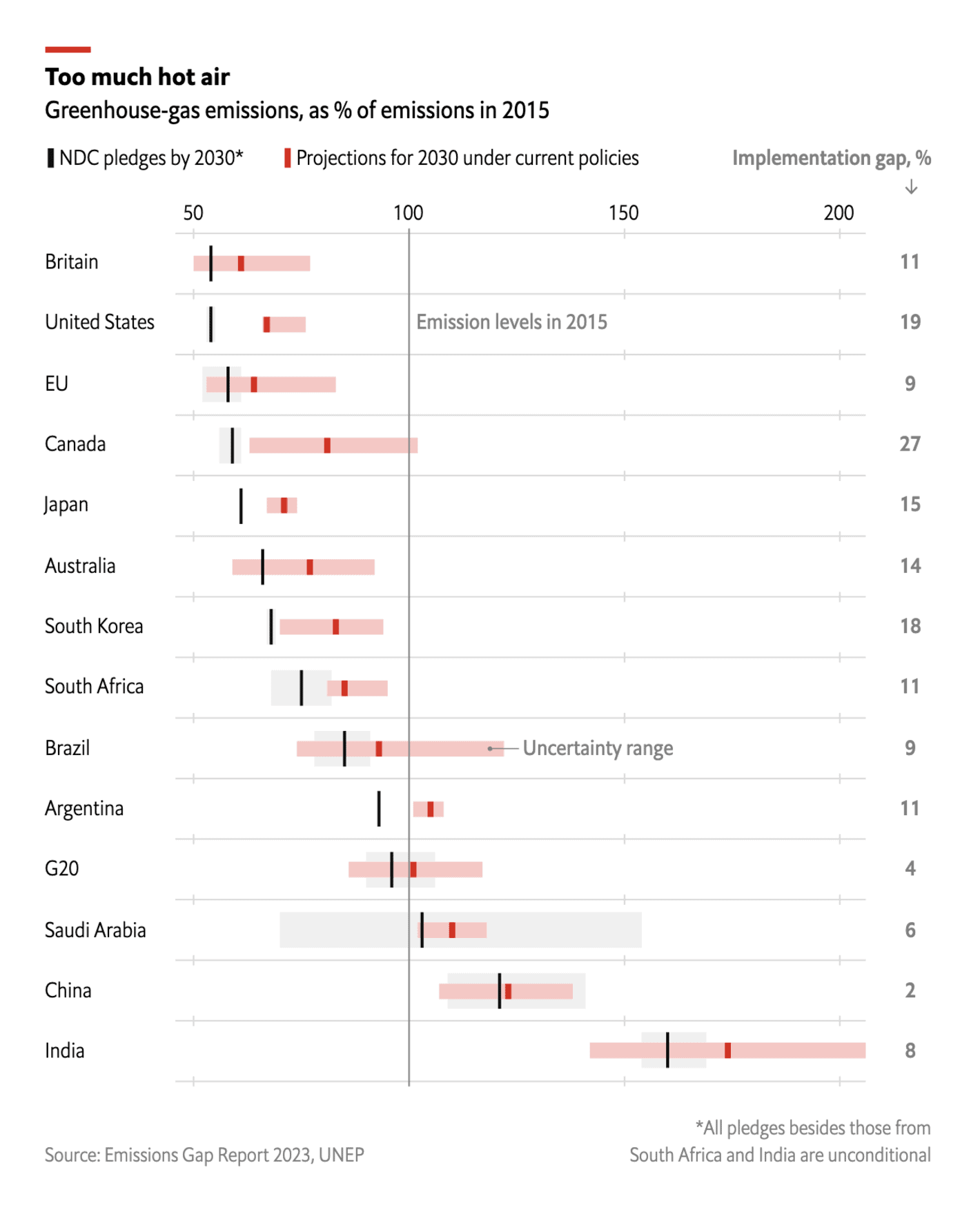
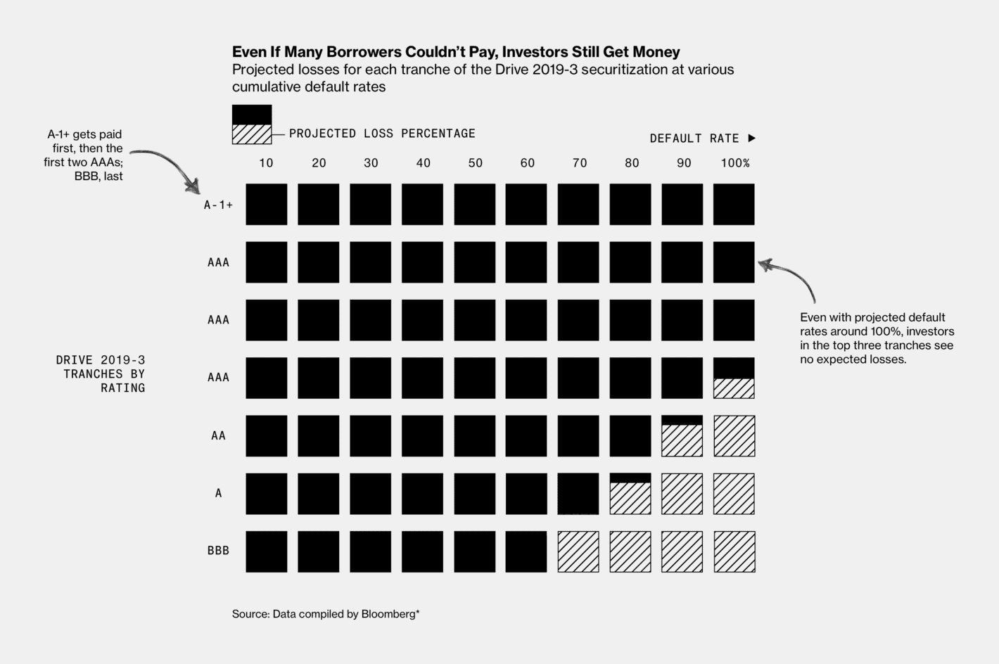
Other notable data vis of the week covered diabetes in Tunisia, greenhouse gas emissions in various countries around the world, lender profits on Wall Street and child protection processes in Minnesota.
Help us make this dispatch better! We'd love to hear which newsletters, blogs, or social media accounts we need to follow to learn about interesting projects, especially from less-covered parts of the world (Asia, South America, Africa). Write us at hello@datawrapper.de or leave a comment below.