The best of last week’s big and small data visualizations
Veronika Halamková
Welcome back to the 66th edition of Data Vis Dispatch! Every week, we’ll be publishing a collection of the best small and large data visualizations we find, especially from news organizations — to celebrate data journalism, data visualization, simple charts, elaborate maps, and their creators.
Recurring topics this week include elections (not only) in Brazil, energy and mining, and the #30DayMapChallenge.
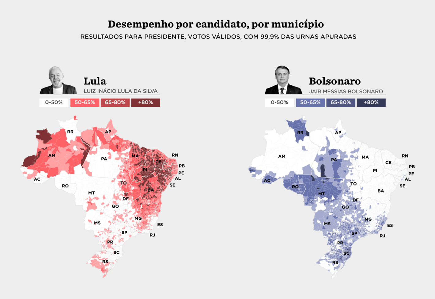
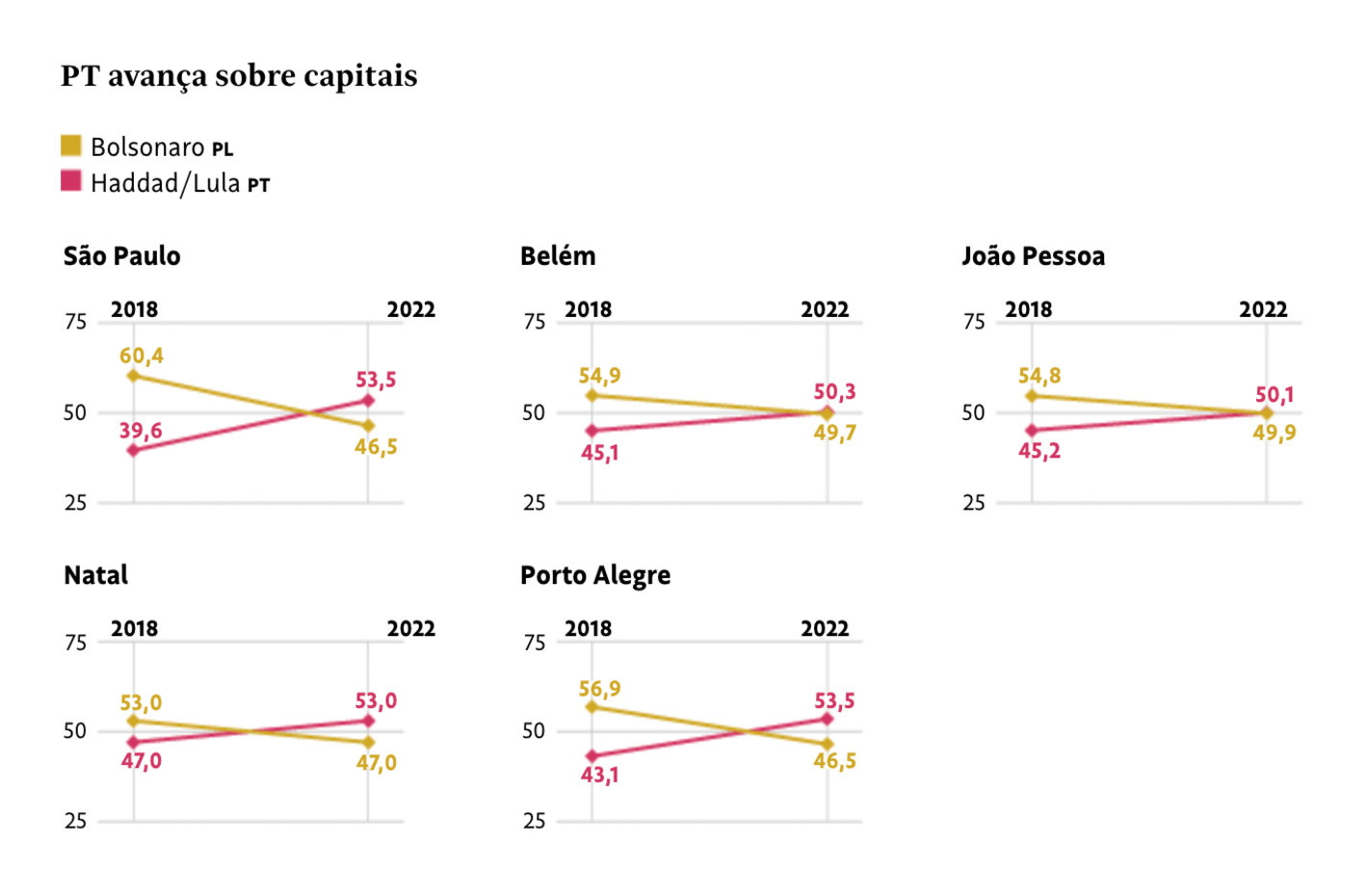
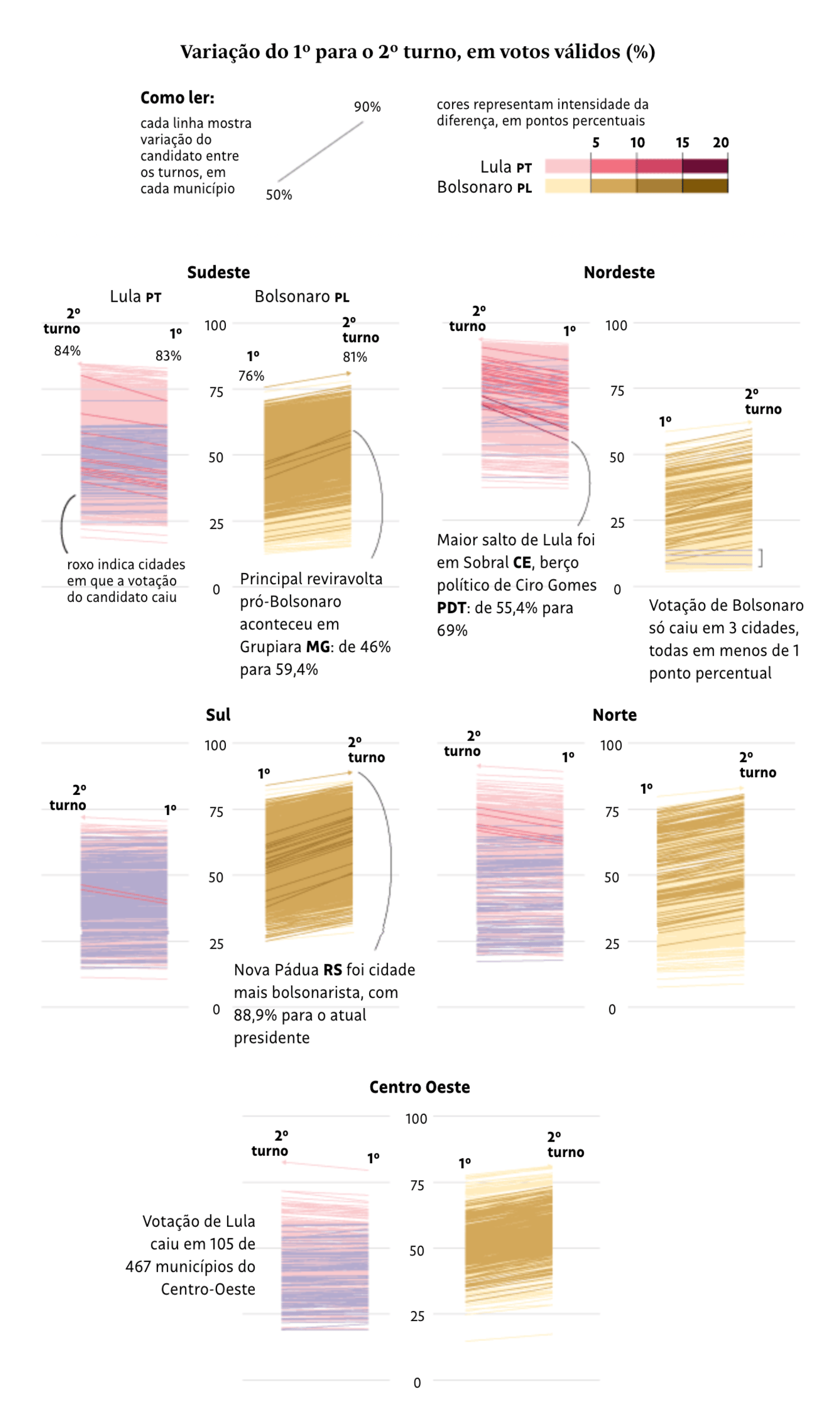
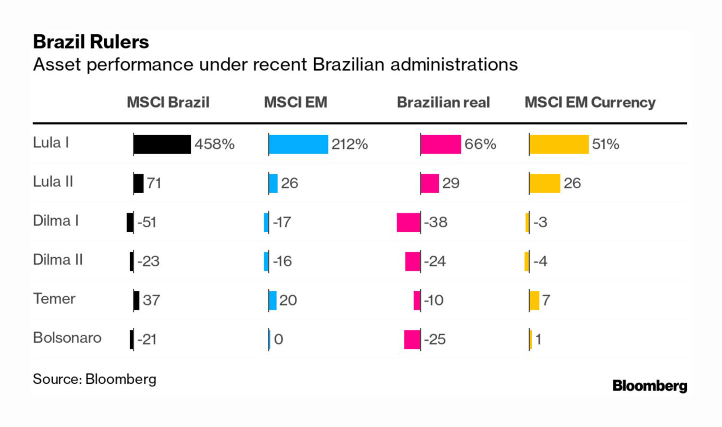
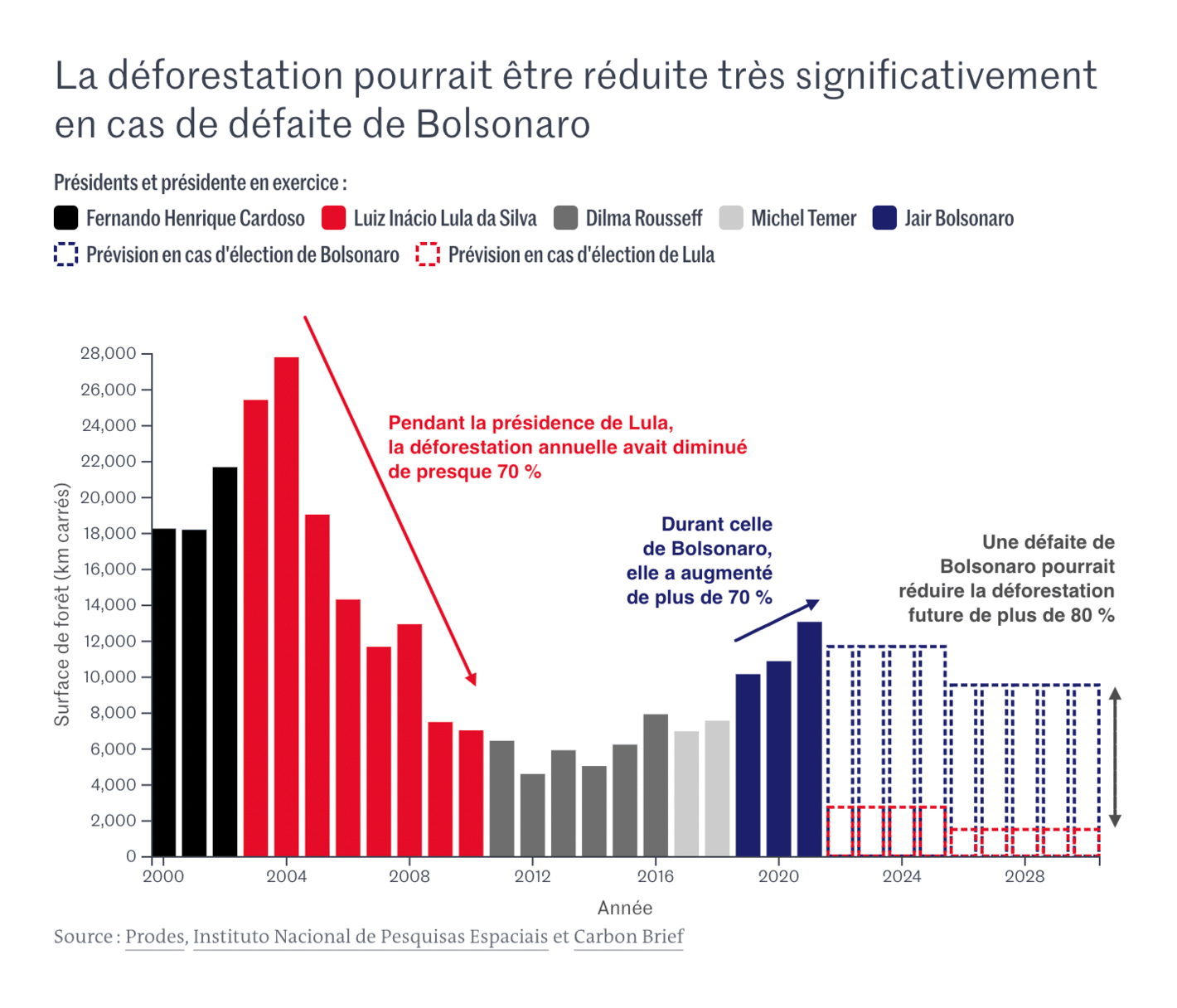
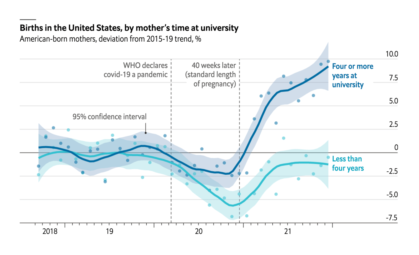
Former president Lula defeated Bolsonaro in the second round of Brazil's presidential election on Sunday, October 30. Charts and maps covered mostly election results but also what Lula's presidency might mean for the markets and the Amazon rainforest.
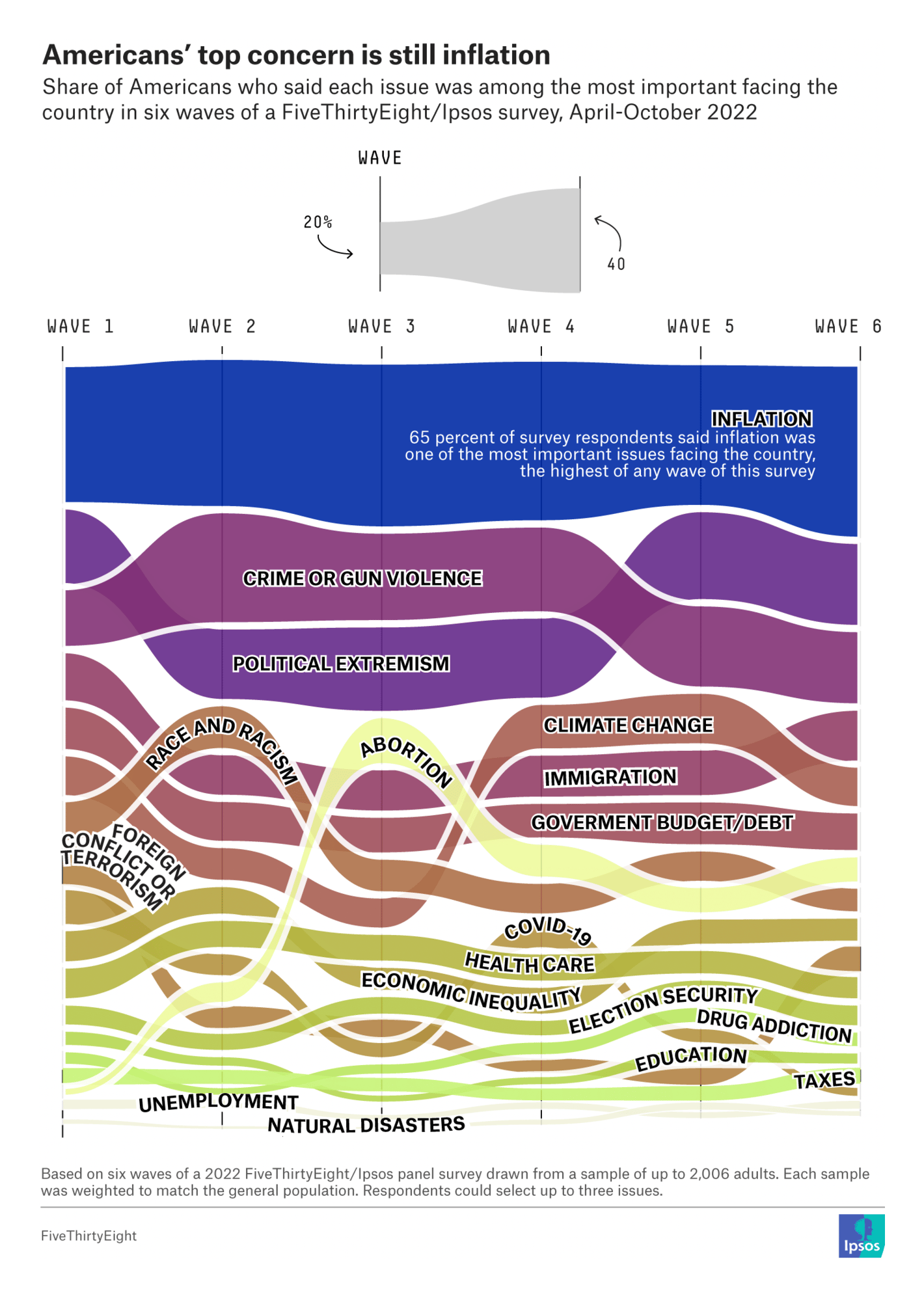
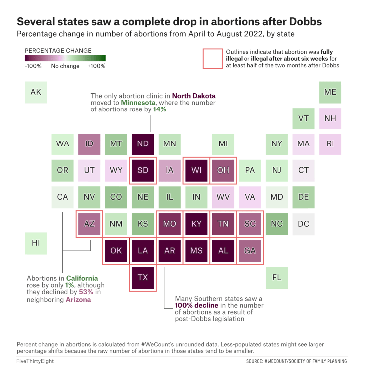
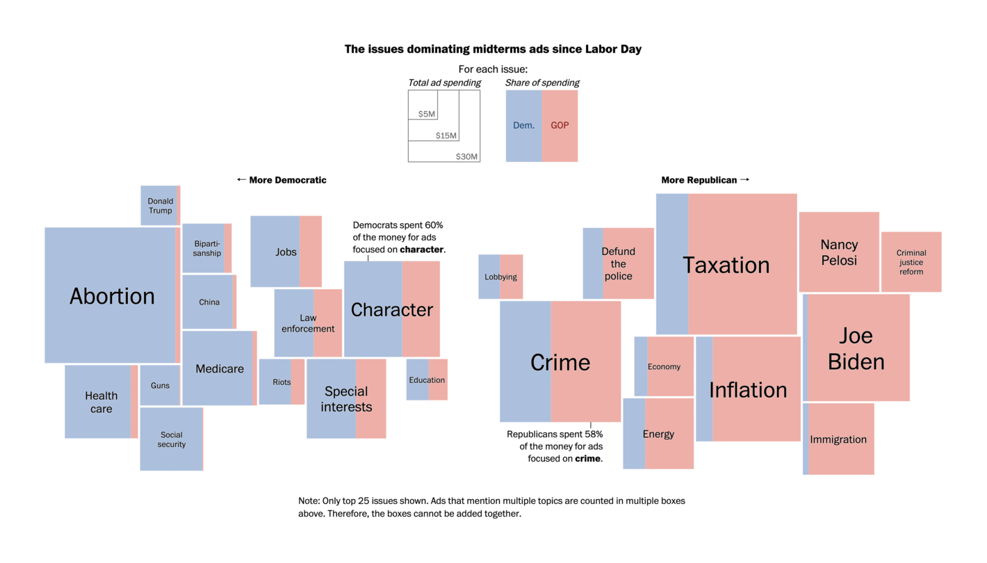
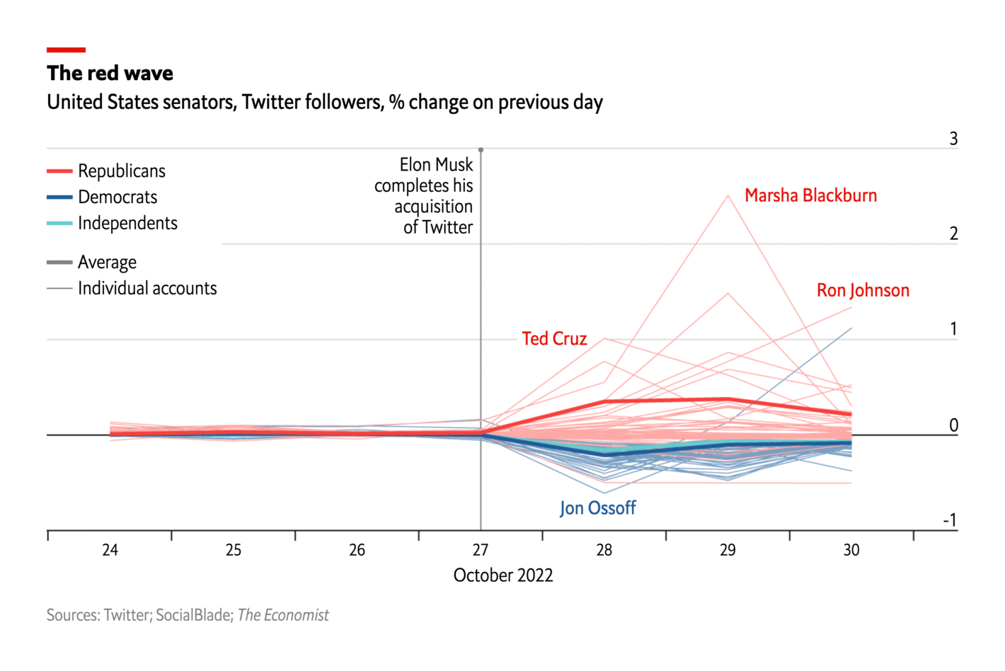
Next up: U.S. midterm elections. With only a week to go, newsrooms are busy analyzing and visualizing everything from voters' main concerns to campaign messaging.
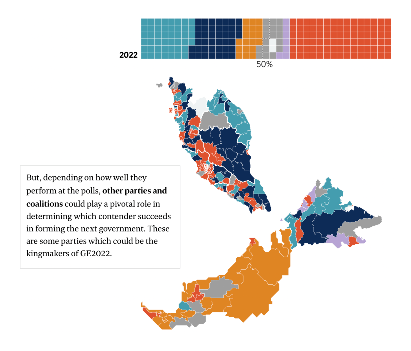
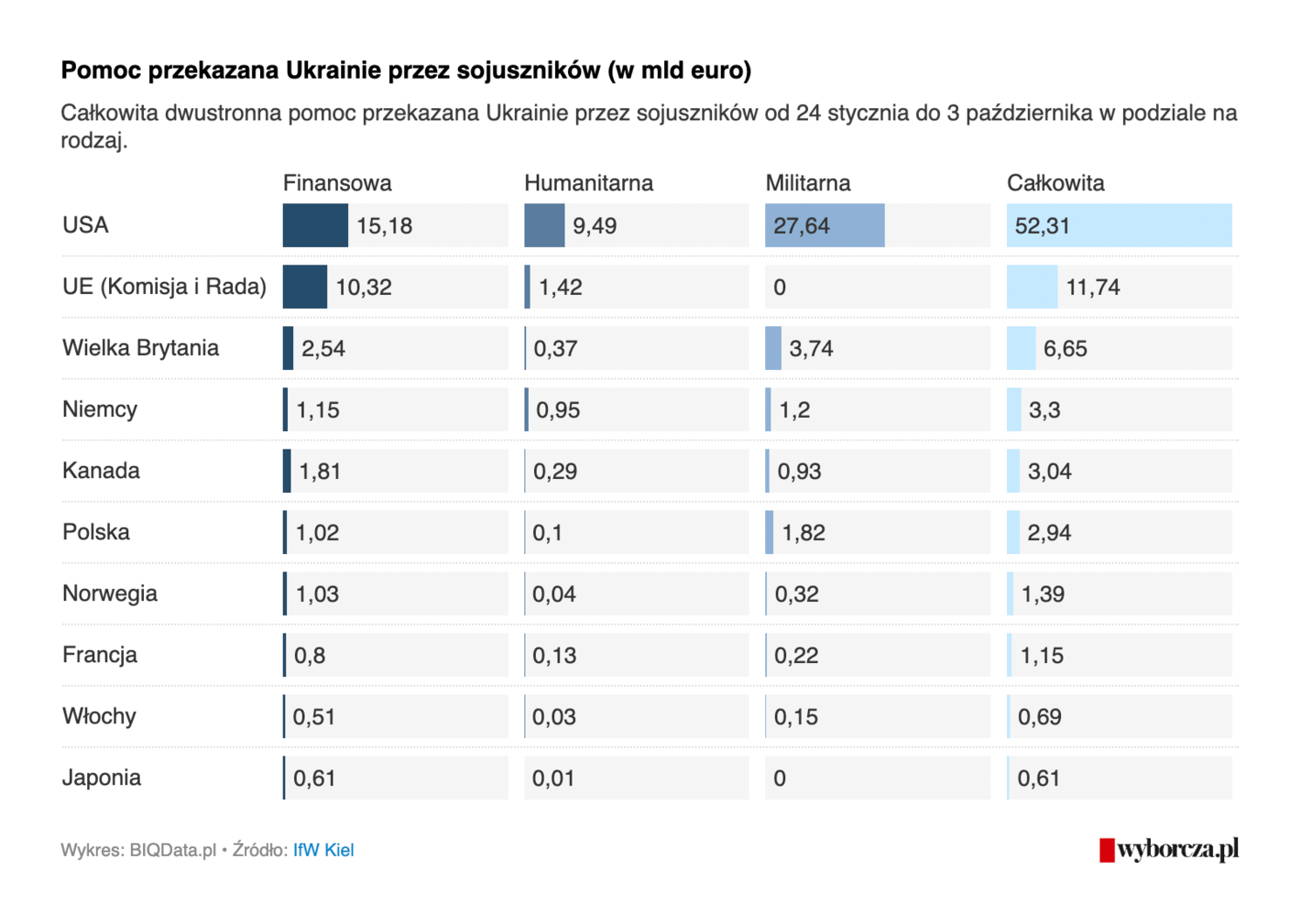
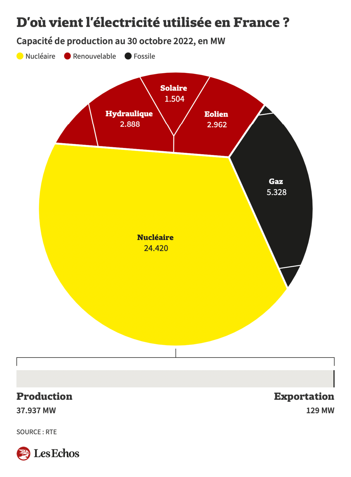
In other political news, Malaysia will hold a general election on November 19, protests in Iran continue, and Ukraine faces Russia's attacks with foreign support. Xi Jinping breaks with political tradition in China.
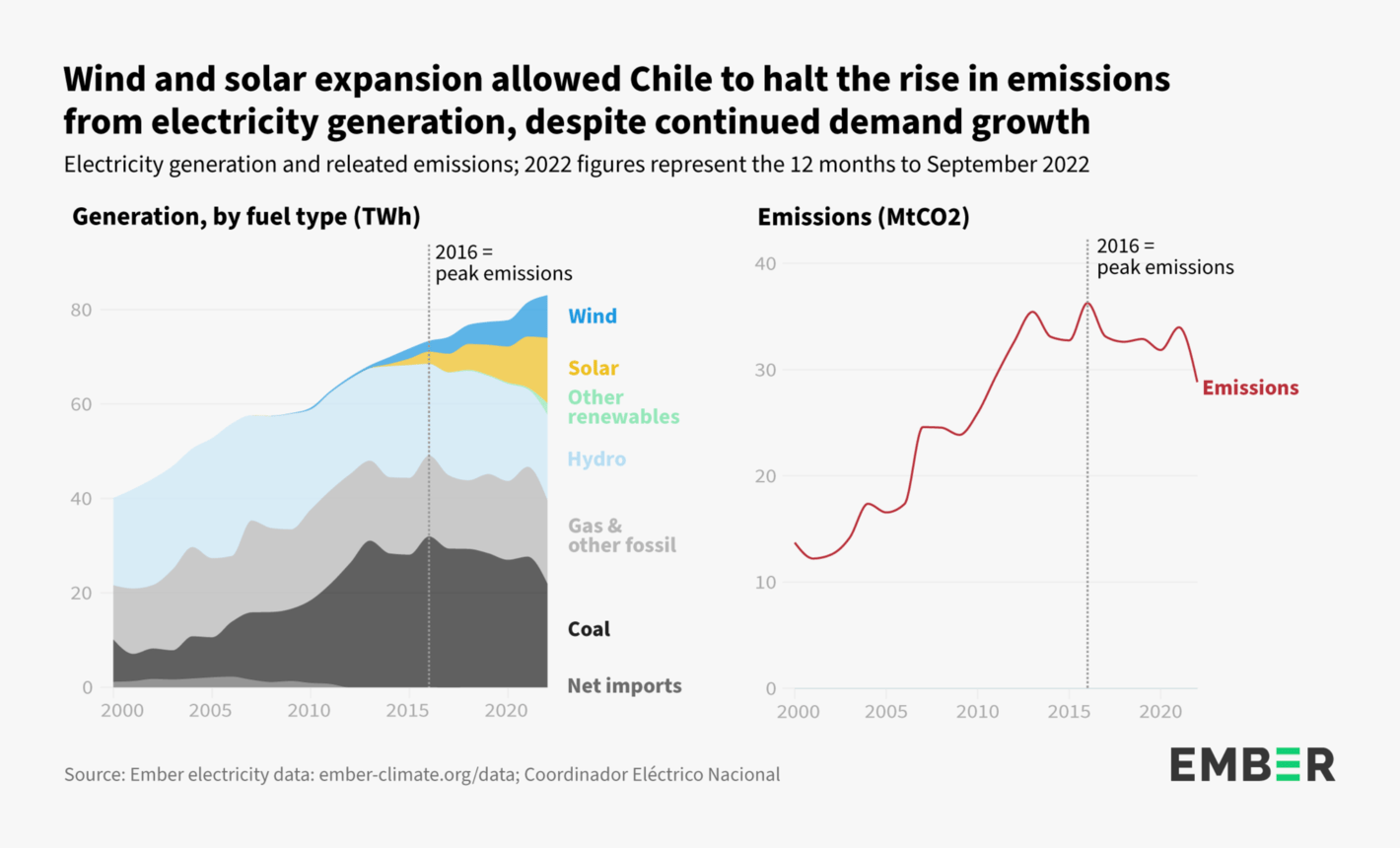
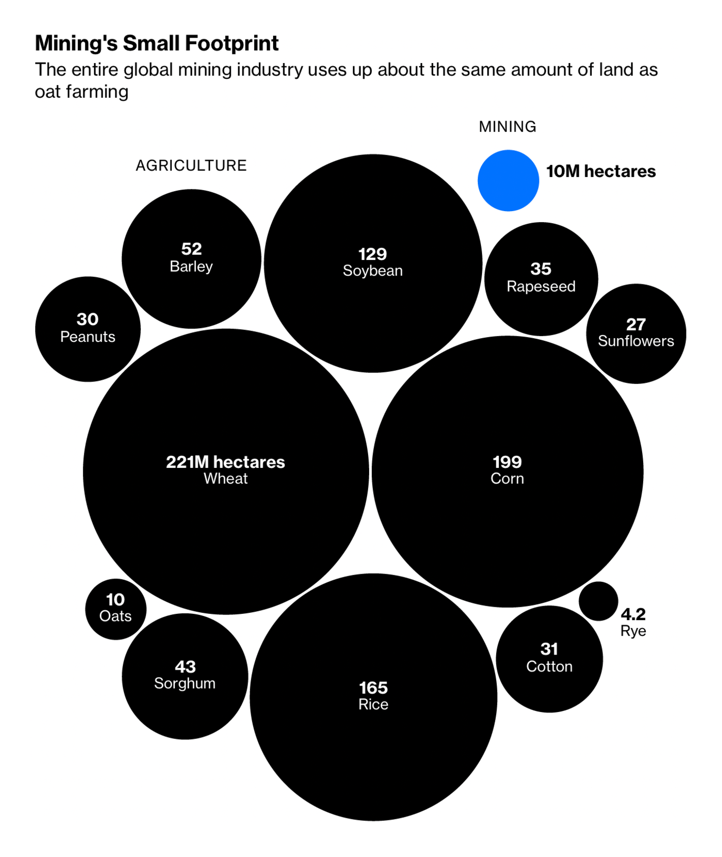
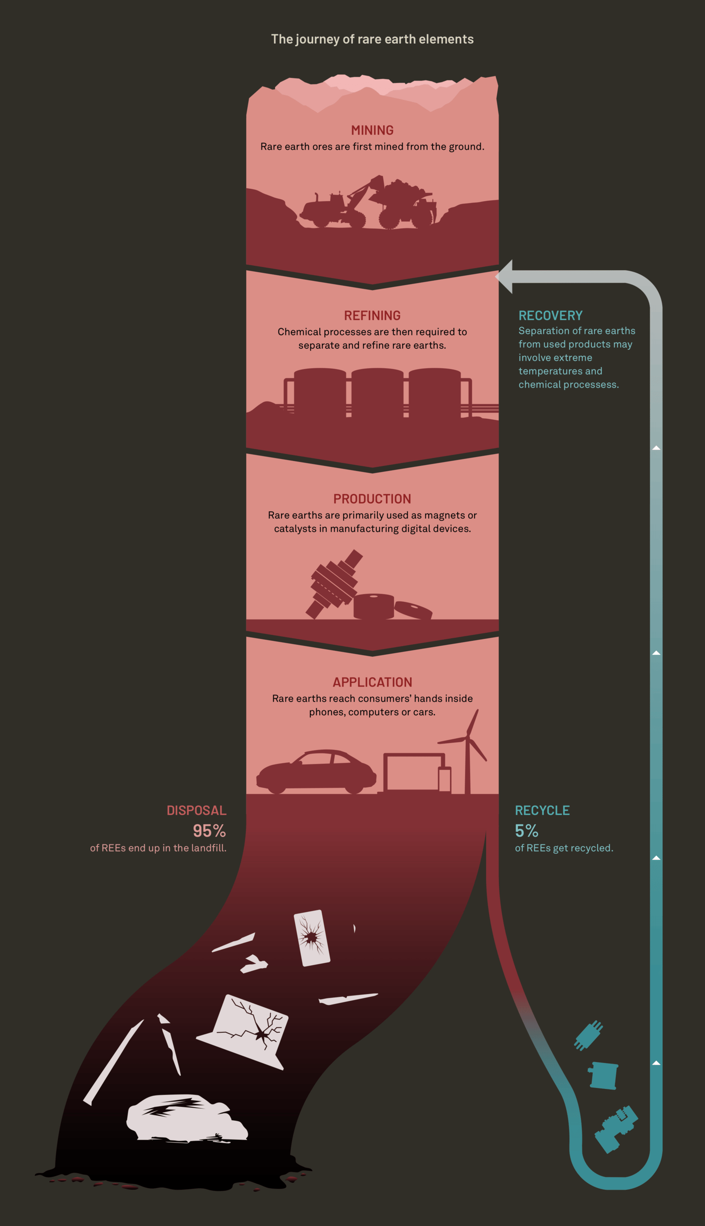
Rare earth minerals have become another crucial resource. Mining might be less land-intensive but it brings its own negative impacts — on the environment, workers' health, and vulnerable communities.
Every year, the end of October is a scary and dangerous time to be out on the streets. Apart from a regular spike in car accidents involving pedestrians, this year's Halloween was marked by a tragic crowd crush in Seoul.
Finally, the #30DayMapChallenge has begun and we'll be bringing you amazing maps throughout November. Starting today with #points!
Topi Tjukanov: "30DayMapChallenge Day 1: Points representing windfarms around the globe. Point size == capacity. Data: Global Wind Power Tracker, Global Energy Monitor, May 2022 release," November 1 (Tweet, Vis)Andrew Douglas-Clifford: "Day 1 of #30DayMapChallenge - Points. A 👉 map pointing you to all the peninsula points in New Zealand," October 31 (Tweet)
What else we found interesting
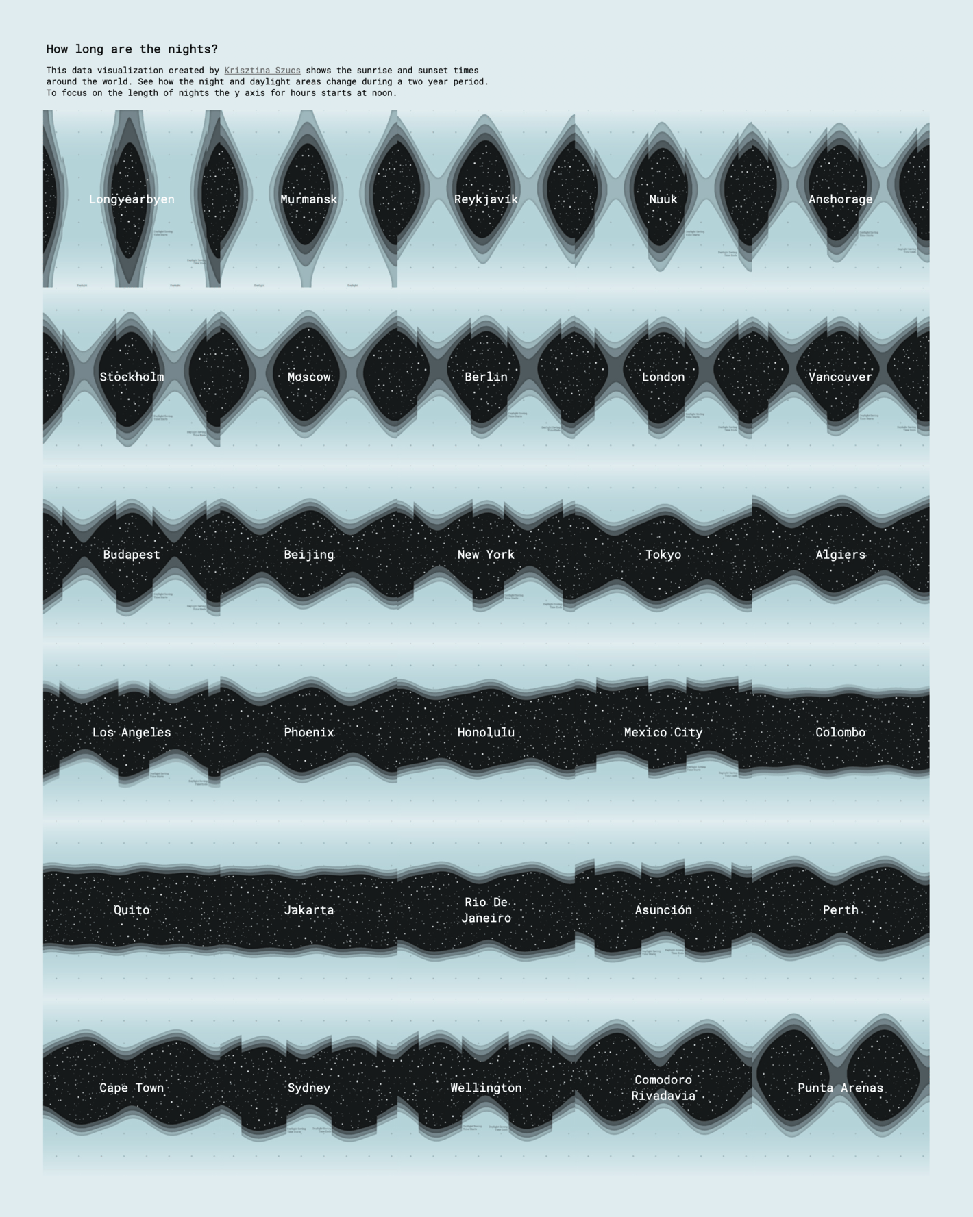
The Washington Post: D.C.’s great rat migration — and how they survived during the pandemic, October 28Cara Thompson: "For this week's #TidyTuesday Technical Challenge, I decided to recreate one of @januszbakes's iconic drip cakes using data from the #GBBO," October 27 (Tweet)Krisztina Szűcs: "Daylight Saving Time ended today in many European countries but it always ends a week later in most of North America (see the small "jump" in the gif).🤯 Is it really because this way children can go trick-or-treating in more daylight?", October 30 (Tweet)
Help us make this dispatch better! We'd love to hear which newsletters, blogs, or social media accounts we need to follow to learn about interesting projects, especially from less-covered parts of the world (Asia, South America, Africa). Write us at hello@datawrapper.de or leave a comment below.