The best of last week’s big and small data visualizations
Veronika Halamková
Happy new year, and welcome back to the 75th edition of Data Vis Dispatch! Every week, we’ll be publishing a collection of the best small and large data visualizations we find, especially from news organizations — to celebrate data journalism, data visualization, simple charts, elaborate maps, and their creators.
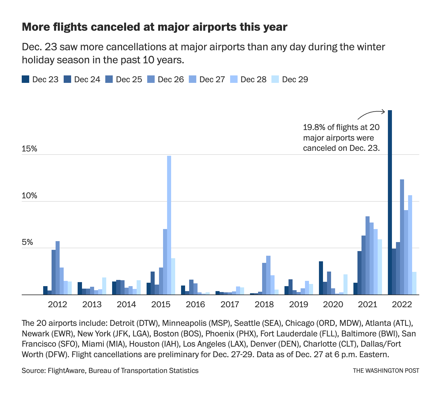
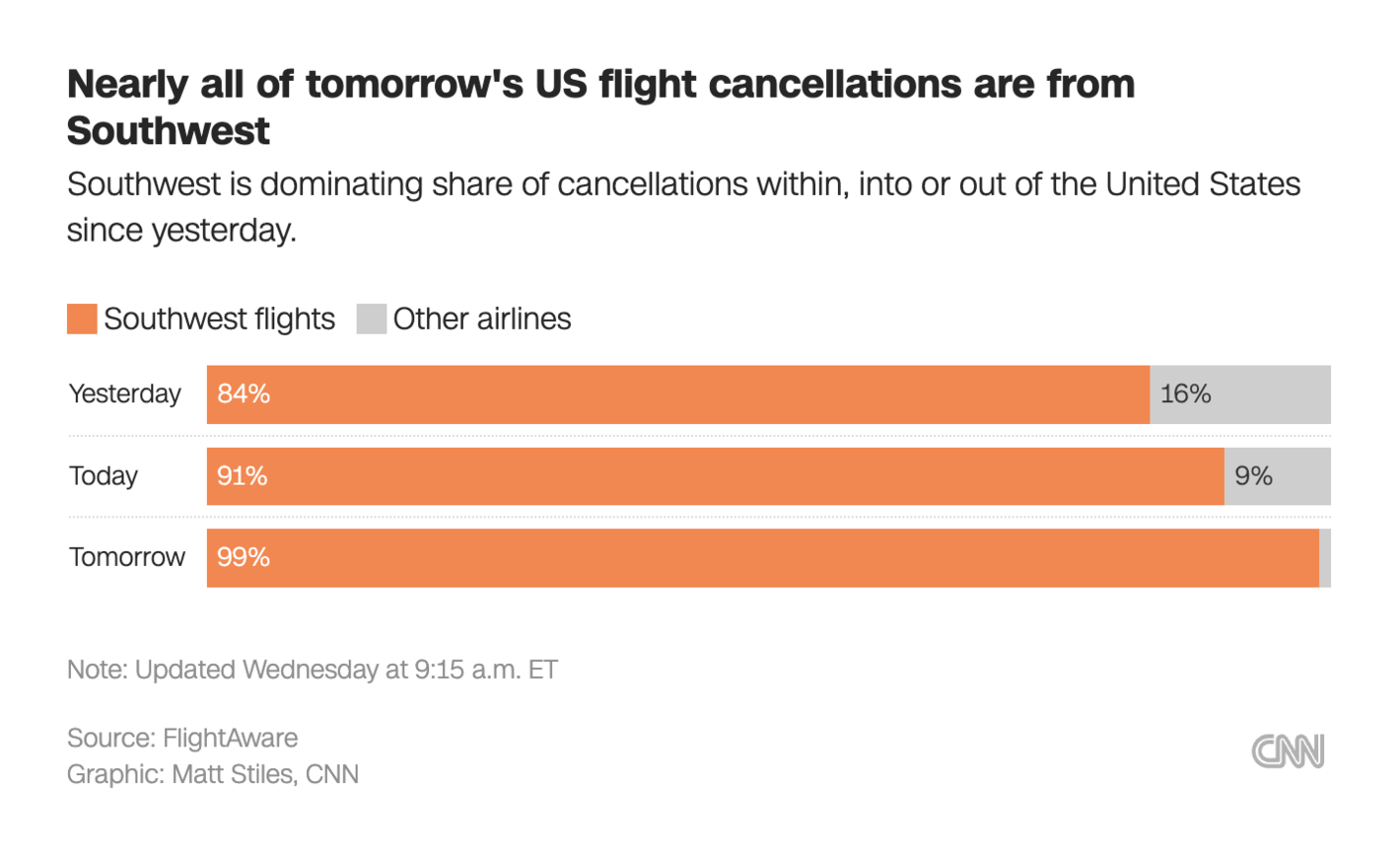
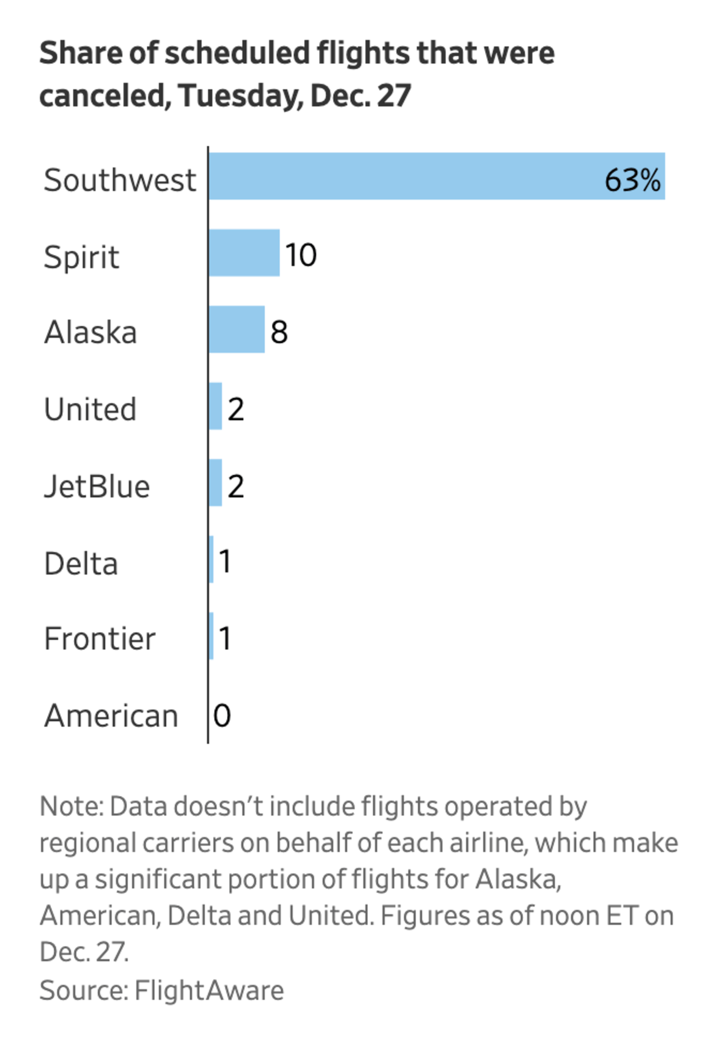
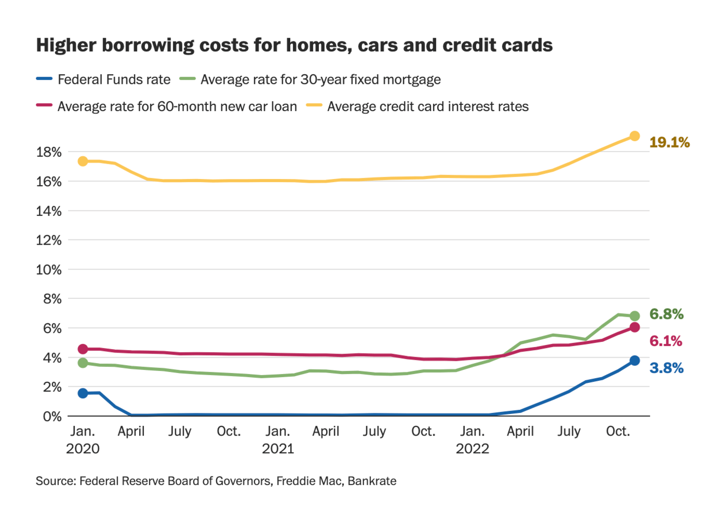
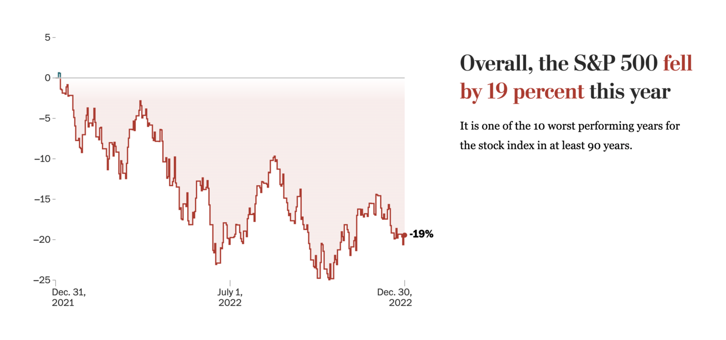
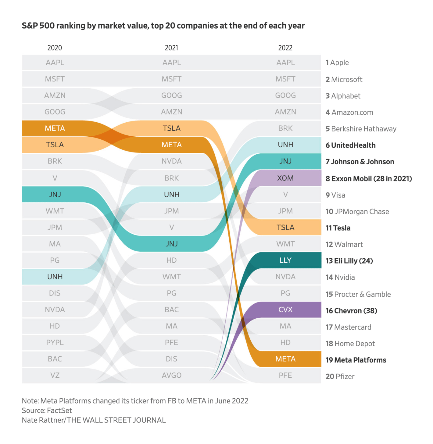
Recurring topics this week include data vis highlights of 2022, flight cancellations, and the economy.
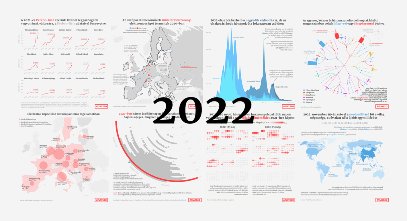
The turn of 2022 and 2023 has been a quiet one in the data vis world. Still, a few themes stood out. More newsrooms have shared their data-driven highlights of the year.
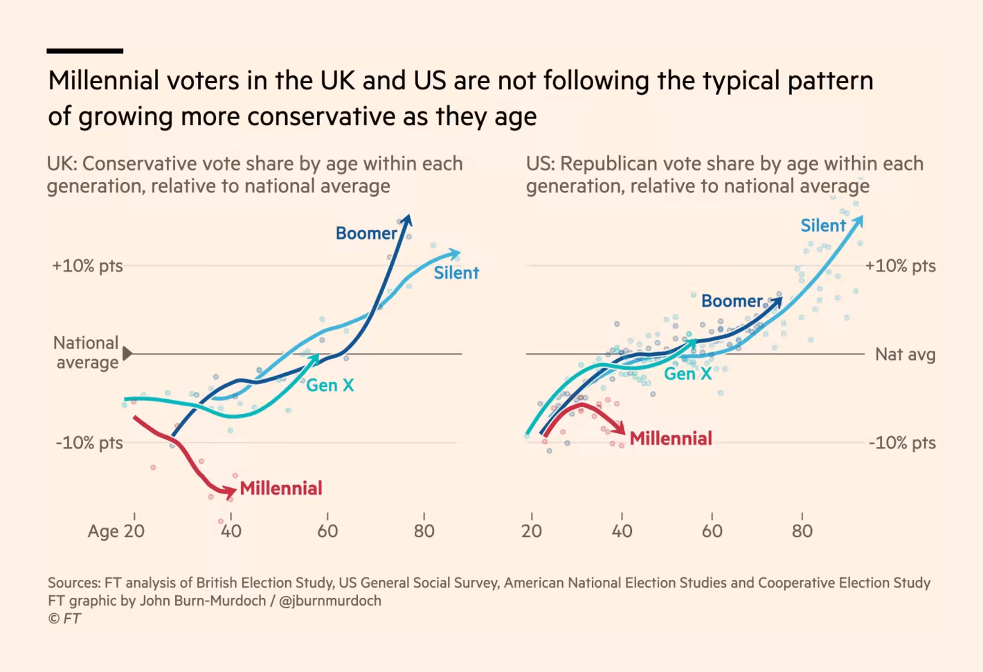
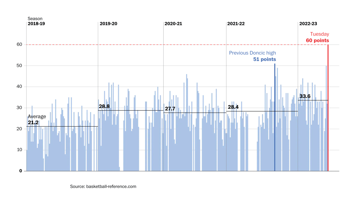
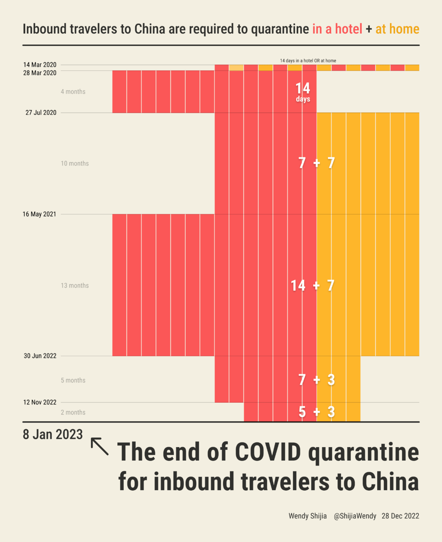
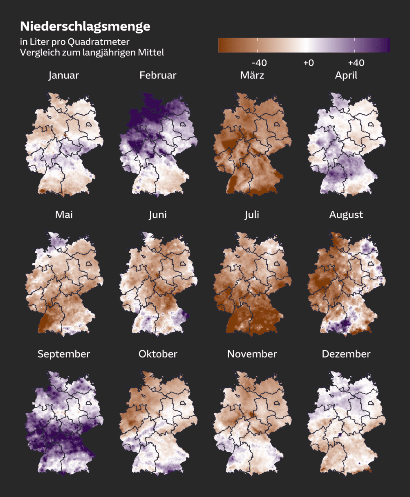
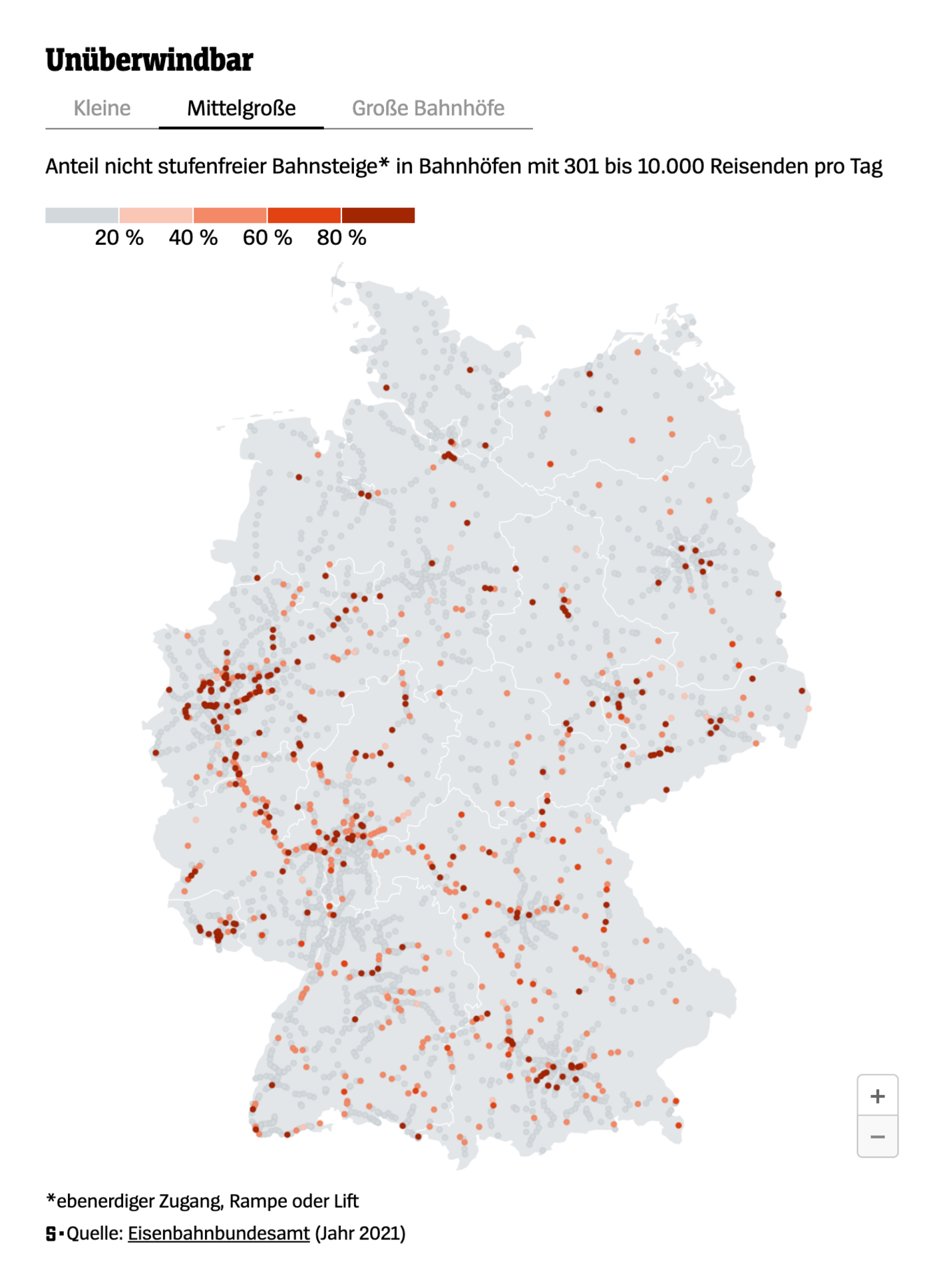
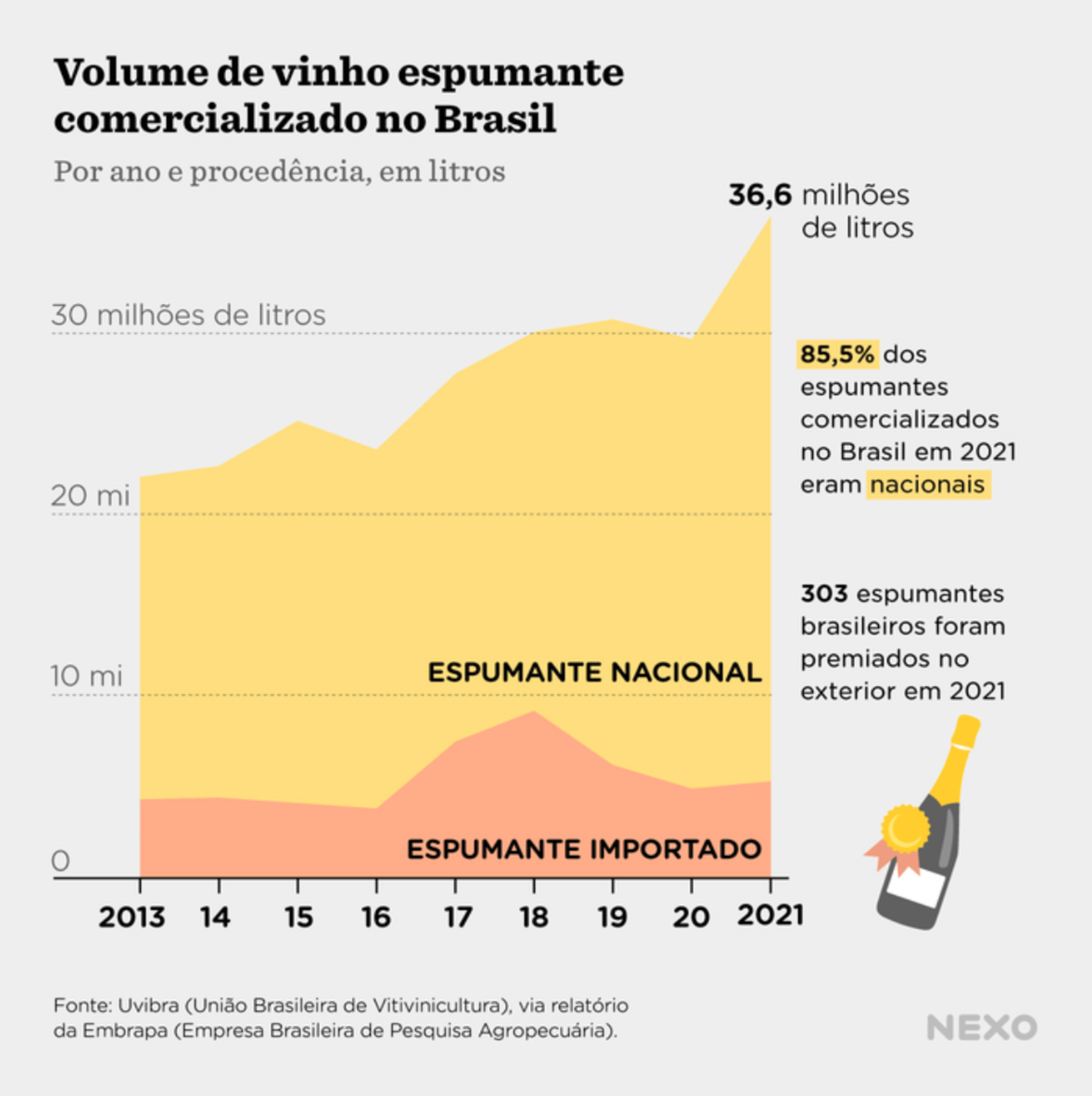
Other notable charts covered millennial voters, an NBA record in the U.S., quarantine policies in China, the changing climate and height of train platforms in Germany, and champagne sales in Brazil.
Help us make this dispatch better! We'd love to hear which newsletters, blogs, or social media accounts we need to follow to learn about interesting projects, especially from less-covered parts of the world (Asia, South America, Africa). Write us at hello@datawrapper.de or leave a comment below.