
Stacked column chart
Create beautiful stacked column charts with Datawrapper
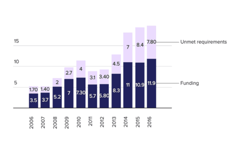
Our automatic labeling saves you time and nerves.
As soon as you upload your data, you will see a good-looking stacked column chart – but every data set is different, and we want to help you communicate it best.
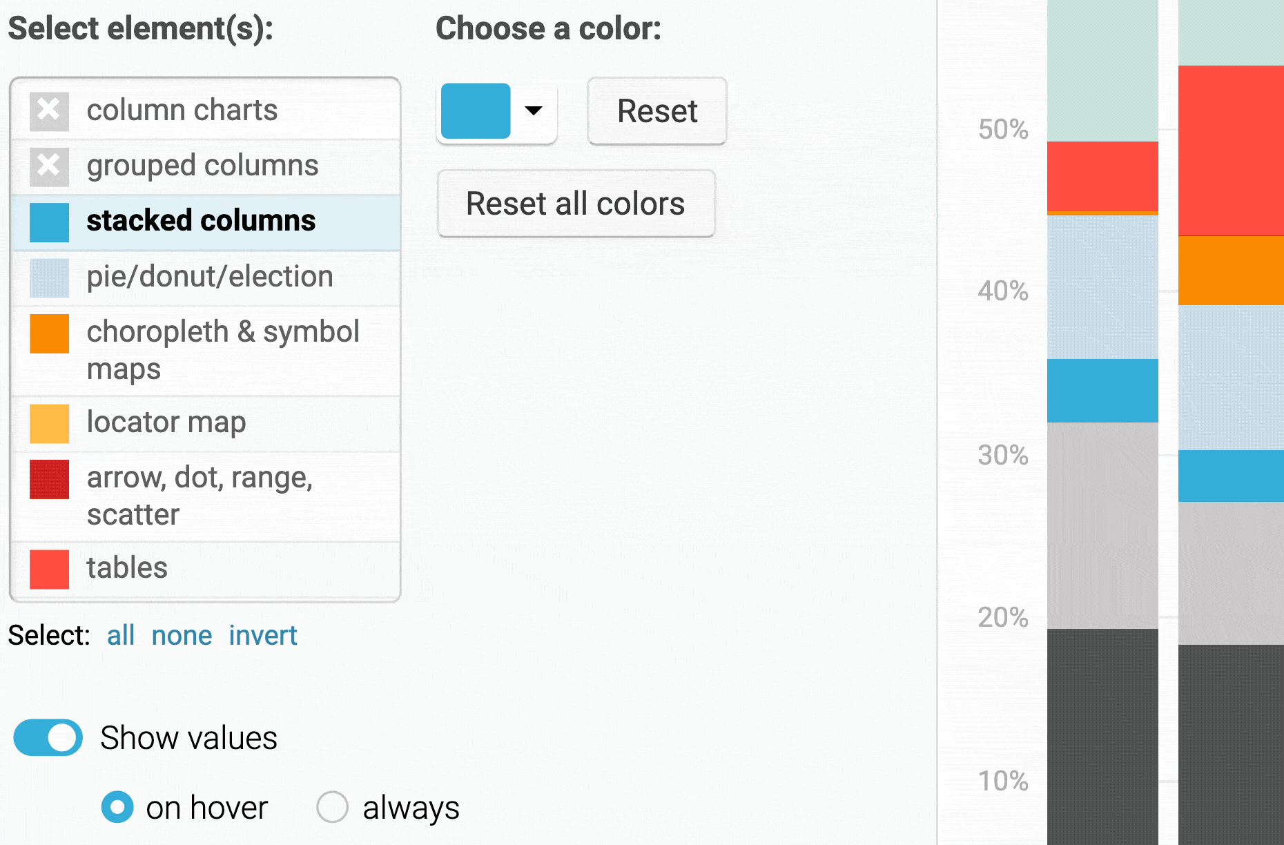
Changing the colors? Turning off gridlines? Sorting columns? Increase the space between columns? It’s all possible. Just click around until you’re happy.
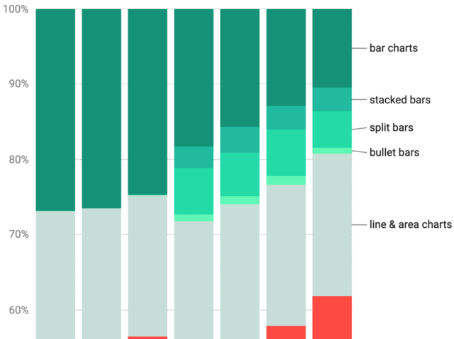
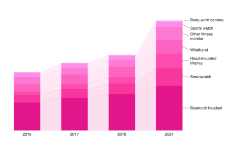
Interactivity in charts can increase the readability. Try to hover or tap on any of the areas in this chart – and you will see how the other parts tone down and make it easier to focus on your selected area.
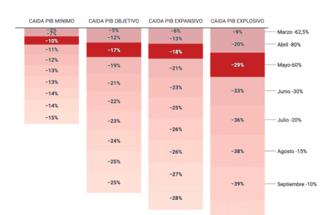
It’s good data vis practice to label elements directly: It decreases the cognitive load on your reader’s side. Our stacked column charts label directly automatically, while making sure that labels don’t overlap each other.


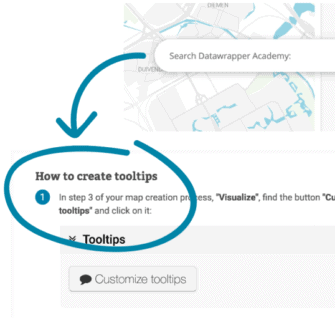
Need help creating Datawrapper charts?
We’re here for you.

Try it for yourself, without signing up
