Grouped bars

Create beautiful, responsive grouped bar charts
With Datawrapper, it’s “ridiculously easy”
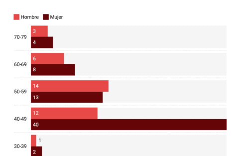
As soon as you upload your data, you will see a good-looking grouped bar chart – but every data set is different, and we want to help you communicate it best.
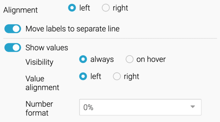
You need to move the labels to a separate line? Or sort your bars differently? Or align the values on the left instead of on the right? Just click around until you’re happy with the result.
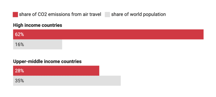
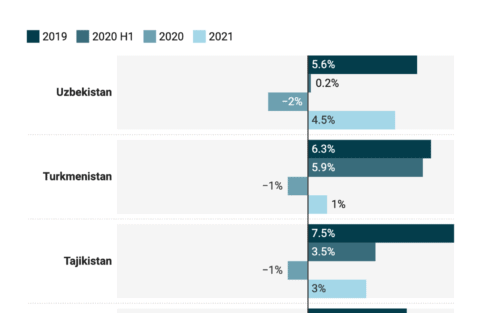
Lead the reader’s eye by highlighting your most important bar category – in Datawrapper, that’s just a few clicks. And the color key is turned on by default, explaining to your readers what your colors indicate.
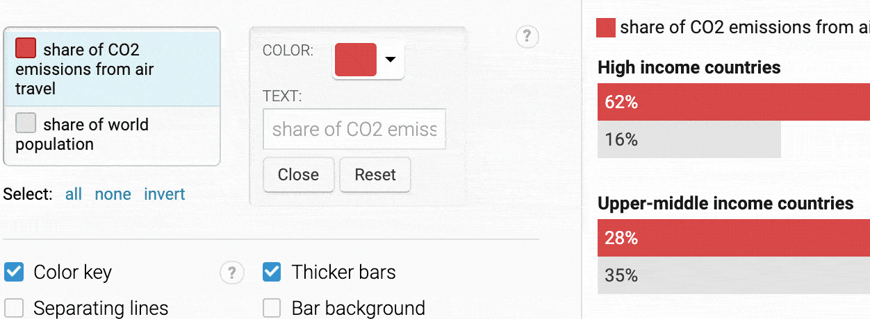
Datawrapper offers several number formats with which you can display the numbers as you need them. Turn 3,238,190 into a better readable 3.2m with two clicks, or 0.3760483 into a 0.38.


Need help creating Datawrapper charts?
We’re here for you.

Try it for yourself, without signing up